Personal Income and Consumption

Summary

I have argued for some time that a robust recovery will occur after households adjust spending downwards. I believe that households must adjust spending down to reflect levels of lifetime wealth that are lower, after the global financial crises of 2008-2009, than had been expected prior to the crisis. Another way to say the same thing is that households need to adjust their savings upwards to accomplish a long-term deleveraging and readjustment of debt levels

The data show that such adjustment may be starting to occur. This is good news and bad news. The good news is that it will allow a robust recovery. The bad news is that it implies there will be a recession, potentially a bad recession, before that recovery can occur.

The 2008-2009 recession and the current recovery are all about households de-leveraging and adjusting spending levels downwards relative to income. There are, however, key aspects of the recent past that are often neglected or misunderstood:

  • Starting in 2008 the “Savings rate” rose, particularly after the crisis hit in late 2008.
  • But, the rise in the savings rate from 2008-2010 was almost entirely due to changes in taxes and almost not at all due to changes in household behavior. (See the discussion below on the difference between savings as percent of personal income versus disposable income.)
  • For 2011 the reverse has been true – changes in household behavior

Note that any rise in the “savings rate” due to lower taxes is not really an adjustment in household behavior or overall debt profile. Increased government debt will eventually have to be repaid through future higher taxes.

Table 1 shows the current savings rate and spending rates (quarterly) during and subsequent to the recession. A few points to note:

  • During 2008-2010:
    • The savings rate (as percent of personal income – see discussion below) rose by 2.5 percentage points
    • Of this 2.5 percentage point rise, 2.6 percentage points was due to lower taxes
  • During 2011 so far (admittedly only two quarters)
    • The savings rate has been almost unchanged
    • Spending fell by 0.7 points, taxes rose by 0.8 points

Table 1

Table 1 - Savings Rate and Decomposition for 2007-2010

Source: Bureau of Economic Analysis and Author’s Calculations

If, as I think will happen, households continue to adjust spending down and taxes rise modestly, there will be a recession. This will, however, set the stage for a robust recovery to follow.

Since the bubble burst in 2007-2008 all forms of wealth have fallen – falling housing prices have reduced real estate holdings; stock markets have fallen or stagnated; and, probably most importantly, employment and prospects for future earnings have fallen. The fall in lifetime wealth should naturally induce some adjustment in household spending. The recession was simply that adjustment of spending to new levels of perceived wealth.

I don’t think the imbalances that led to the financial crisis of 2007-2009 are fully redressed (at least in the US). Spending is supported by low taxes (an explicit government policy to ameliorate the recession of 2008-2009). Eventually taxes will have to rise to fund the government deficit, and this will put pressure on spending. Either the savings rate will fall (building future imbalances) or spending will fall (recession).

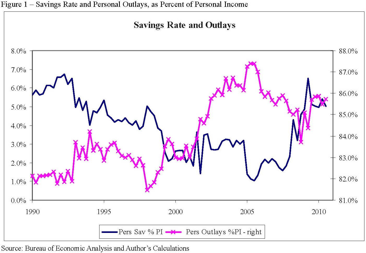
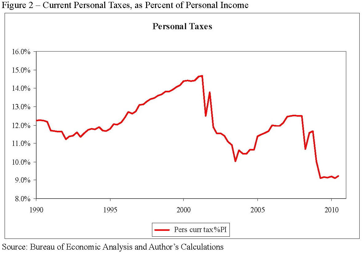
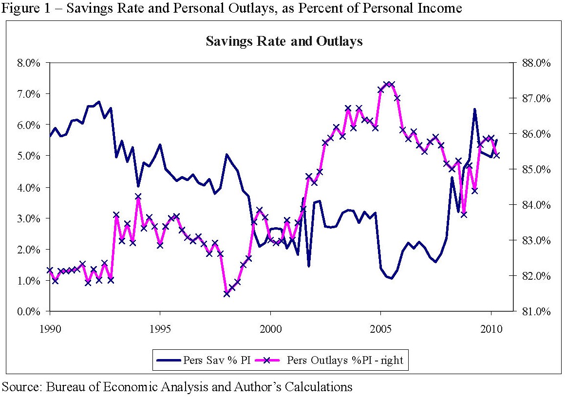
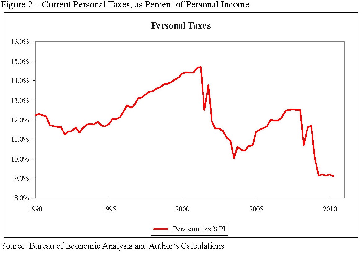
Longer-term trends (over the past two decades) are shown in figures 1 and 2:

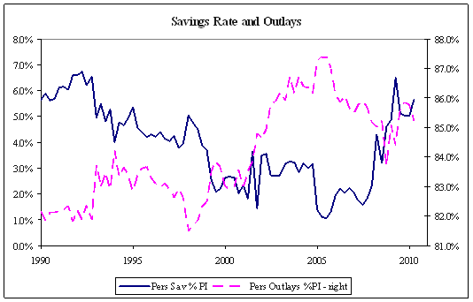
  • Savings rate (more accurately, what is left over from current spending) fell from roughly 6% of income to below 2% in 2007/2008 and has now rebounded to almost 6%.
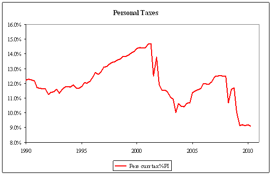
  • Taxes rose during the late 1990s but fell dramatically post-2000, and again in 2008/2009.
  • Spending has risen from about 83% of income (1990s) to over 87% in 2005 and is now roughly 86%. It is still high by historical standards and supported by low taxes, even if not as high as during the bubble.

Household debt (measured in the Federal Reserve’s quarterly flow of funds reports) has fallen since early 2008, from 96.4% of GDP in QI 2008 to 93.6% in QIV 2009. This is good news and shows households have started de-leveraging. Unfortunately the increase in government debt has been far larger. According to the OECD, central government debt for the US grew by $2.5tn from 2007 to 2009, or from 35.6% of GDP to 53.1%. Future tax liabilities, which are a future liability and thus function as a sort of implicit household debt, have probably offset any decrease in directly-owned household debt. The net result is that household leverage has probably not decreased much, if at all, over the past three years.

Figure 1

Figure 1 - Savings Rate and Personal Outlays, as Percent of Personal Income

Source: Bureau of Economic Analysis and Author’s Calculations

Figure 2

Figure 2 - Current Personal Taxes, as Percent of Personal Income

Source: Bureau of Economic Analysis and Author’s Calculations


Decomposition of Movements in Spending and the Savings Rate

Table 1 shows the savings rate. The definitions of savings and spending rates, together with a decomposition of savings as a percent of personal income, are discussed here.

Economists commonly consider the “savings rate,” which is the difference between current income and spending – the excess of income left after spending and taxes are accounted for. The definition is:

Savings Rate = (Disposable Personal Income – Personal Outlays) / Disp Pers Inc .

(This “savings rate” is not exactly savings as one usually thinks of savings, but rather a definition of the excess of income over spending in the aggregate economy. One could equally well talk of the “spending rate” – Outlays / Income – which is just one minus the “savings rate”.)

It is useful to decompose the rise in the savings rate in order to understand it a little more. To do so it is useful to consider savings as a percent of total personal income. Basically,

Disposable Personal Income = Personal Income – Personal Current Taxes

Savings = Disposable Personal Income – Personal Outlays

The standard definition of the savings rate is savings divided by Disposable Income:

Savings Rate (DPI) = (Disposable Personal Income – Personal Outlays) / Disp Pers Inc

= 1 – Personal Outlays / Disp Pers Inc

We can, however, define a savings rate divided by personal income that is only slightly different:

Savings Rate (PI) = (Personal Income – Personal Current Taxes – Personal Outlays) / Pers Inc

= 1 – Pers Curr Taxes / Pers Inc – Pers Out / Pers Inc

Since DPI and PI differ only by Pers Curr Taxes, which has monthly changes that are not large relative to the level of DPI and PI, the two measures will be very much the same. The advantage of the second is that we can decompose changes in that savings rate into changes due to taxes and that due to changes due to outlays (spending).

Posted in Musings, Past - archives | Tagged | Leave a comment

A Practical Guide to Risk Management

Published by the Research Foundation of the CFA Institute in July 2011, this monograph challenges the conventional wisdom that “risk management” is or ever should be delegated to a separate department. Good managers have always known that managing risk is central to a financial firm and must be the responsibility of anyone who contributes to the profit of the firm.

This book serves as a guide to risk management for financial firms and managers. Without the technical sections of the Wiley book above, it focuses on how to think about risk while minimizing the technical content.

This book is available for free download with links here.

Posted in Publications and Papers, Risk Management | Tagged | 2 Comments

A Guide to Duration, DV01, and Yield Curve Risk Transformations

Yield curve risk and sensitivities (DV01s) can be measured with respect to different variables: forward rates, par rates, zero yields, or others. This paper describes a simple method for transforming sensitivities between alternate representations and provides examples. The benefit of this transformation method is that it only requires calculating the risk of a small set of alternate instrument and does not require re-calculating the original portfolio risk.

This is a 35-page paper is available as a .pdf here on the CloseMountain site and also on SSRN. A digitally enhanced version in .cdf/.nbp format is also available with dynamic interactivity enabled (requires free Wolfram Player).

Posted in Publications and Papers, Risk Management, Valuation and Modeling | Tagged | 1 Comment

Probability, Expected Utility, and the Ellsberg Paradox

The Ellsberg paradox is often cited as evidence for unknowable “ambiguity” versus computable “risk”, and a refutation of expected utility maximization and “subjective” or “belief-type” probabilities. I have concluded the paradox is not convincing. The results can be explained by differences in distributions that show up in repeated “games.” The distributions behind Ellsberg’s thought experiments are different and economic agents should be expected to respond to these differences.

The 16-page paper (.pdf) can be found on SSRN, updated May 2011 or here on the Close Mountain site

Posted in Miscellaneous, Publications and Papers | Tagged | Leave a comment

Black Swans and Brown Turkeys

Black Swans and Brown Turkeys

The term Black Swan was introduced by Taleb to denote an event not only unexpected but not even considered within the realm of possibility – something so unexpected that it completely changes the terms of discussion. But the term is at risk of being over-used, and most sightings of a Black Swan turn out to be nothing more than Brown Turkeys – events that are indeed unexpected but not exceptional probabilistically speaking. Like wild turkeys these events are hard to find and rarely seen, particularly if you’re out hunting for Thanksgiving dinner. And like wild turkeys these events are out there and they do turn up, seemingly out of nowhere and always most inconveniently, say around that blind curve on the downhill mountain-bike ride. And they’re all brown. It just seems that we humans are not particularly good at intuiting probabilities (see, for example, Mlodinow’s The Drunkard’s Walk: How Randomness Rules Our Lives) and we often mistake the merely unexpected for the truly exceptional.

Stock Market for 2008

Consider the stock market performance for 2008, which many people will want to claim as a “Black Swan” event – out of the realm of all possibility. In fact it is nothing of the sort. The S&P index (capital appreciation) fell by 38.49% for the year. Really bad and quite unexpected, but by no means out of the realm of possibility:

  • The 2008 return of -38.49% is only third out of the 83 years from 1926 – behind 1937 (-38.59%) and 1931 (-47.07%).  And it was not just the depression that saw big annual drops – in 1974 the S&P fell 29.72%.1
  • Probabilistically we can say the 2008 return was unexpected: based on history the probability of experiencing such a low return in any year is probably below 1% – less than 1 chance in 100.2 But the chance of the lowest return over 83 years being as low or lower is roughly 50%, so in the larger context the 2008 return can’t be claimed as particularly unusual.3
  • Someone looking only at recent history might have thought the likelihood of such a large fall was much lower than 1%. But even doing so and ignoring the large changes of the 1930s, a fall of the magnitude of 2008 would not be particularly unusual when considering a period of many years.4 And furthermore ignoring the experience of the 1930s and 1940s is irresponsible: as George Santayana said, “Those who cannot remember the past are condemned to repeat it.”


  1. Using data from Ibbotson Associate’s SBBI yearbook.
  2. Using data for the period 1926-2007 (i.e. excluding 2008) and if we assume that returns are normal (i.e. ignoring the fact that returns may be fat-tailed and thus possibly estimating the probability as lower than it actually is) the probability of a single year’s return being below -38.59% is about 0.00828: The annual mean and standard deviation for 1926-2007 are 7.41% and 19.15%, and P[Normal Variate < (-.3849 – .0741)/.1915] = .00828.  But if we consider the 83 years from 1926 to 2008 the probability that the lowest return over those 83 years is below -38.49% is 0.49841: P[lowest < (-.3849 – .0741)/.1915] = 1 – (1-.00828)^83.
  3. A careful reader might wish to examine log changes rather than returns (percent changes) because when considering large changes such as 2008 or 1931 the fact that returns cannot be less than -100% may matter.  For log changes the 2008 change was -48.59%, the annual mean and standard deviation for 1926-2007 are 5.42% and 19.29%, and P[Normal Variate < ( .4859 – .0542)/.1929] = .00255.  The probability that the lowest return over 83 years is below -48.59%, however, is 0.19127: P[lowest < (-.3859 – .0542)/.1929] = 1 – (1-.00255)^83.  Still no reason to say that 2008 was extraordinary.
  4. Using only data 1950-2007 the annual mean and standard deviation are 9.25% and 16.22%, and P[Normal Variate < (-.3849 – .0925)/.1622] = .00162.  The probability that the lowest return over 83 years is below -38.49%, however, is 0.12596: P[lowest < (-.3849 – .0925)/.1622] = 1 – (1-.00162)^83.
Posted in Musings, Risk Management | Leave a comment

Personal Income and Consumption

Summary

September personal income figures released yesterday show an increase in spending relative to income. This is not good news because the higher spending means savings rates are down and household de-leveraging and spending adjustments are not proceeding.

In my view a robust recovery will occur when (and if) households have finished adjusting their spending to new, lower, levels of lifetime wealth. The 2008-2009 recession and the current recovery are all about households de-leveraging and adjusting spending levels downwards relative to income. I believe households still have some way to adjust, and perversely government stimulus (implemented to ameliorate the impact of the recession) may have simply delayed the process. Yes, savings rates have recovered dramatically from the lows of 2007. But most of the rise in savings rates has been due to tax cuts rather than lower spending. At some point taxes will have to rise to address fiscal imbalances, and households will likely adjust down spending in response.

Table 1 shows the current savings rate and spending rates (quarterly) during and subsequent to the recession. The savings rate for the third quarter of 2010 is dramatically higher than for 2007 (5.0 versus 1.6 when measured versus total personal income). But almost all of the change in savings rate has been due to falling taxes rather than lower spending: the savings rate rose by 3.45 percentage points with only 0.17 points due to lower spending and fully 3.28 points due to lower taxes. Table 2 shows monthly figures for 2010, with September personal outlays as a percent of income rising and savings rates falling.

Table 1

Table 1 – Savings Rate and Decomposition for 2007-2010

Table 1 – Savings Rate and Decomposition for 2007-2010

Table 2

Table 2 – Savings Rate and Decomposition Monthly 2010

There is no doubt trouble stored up for the future. Since the bubble burst in 2007-2008 all forms of wealth have fallen – falling housing prices have reduced real estate holdings; stock markets have fallen or stagnated; and, probably most importantly, employment and prospects for future earnings have fallen. The fall in lifetime wealth should naturally induce some adjustment in household spending. The recession was simply that adjustment of spending to new levels of perceived wealth.

I don’t think the imbalances that led to the financial crisis of 2007-2009 are fully redressed (at least in the US). Spending is supported by low taxes (an explicit government policy to ameliorate the recession of 2008- 2009). Eventually taxes will have to rise to fund the government deficit, and this will put pressure on spending. Either the savings rate will fall (building future imbalances) or spending will fall (recession).

Longer-term trends (over the past two decades) are shown in figures 1 and 2:

  • Savings rate (more accurately, what is left over from current spending) fell from roughly 6% of income to below 2% in 2007/2008 and has now rebounded to almost 6%.
  • Taxes rose during the late 1990s but fell dramatically post-2000, and again in 2008.
  • Spending has risen from about 83% of income (1990s) to over 87% in 2005 and is now roughly 86%. It is still high by historical standards and supported by low taxes, even if not as high as during the bubble.

Household debt (measured in the Federal Reserve’s quarterly flow of funds reports) has fallen since early 2008, from 96.4% of GDP in QI 2008 to 93.6% in QIV 2009. This is good news and shows households have started de-leveraging. Unfortunately the increase in government debt has been far larger. According to the OECD, central government debt for the US grew by $2.5tn from 2007 to 2009, or from 35.6% of GDP to 53.1%. Future tax liabilities, which are a future liability and thus function as a sort of implicit household debt, have probably offset any decrease in directly-owned household debt. The net result is that household leverage has probably not decreased much, if at all, over the past three years.

Decomposition of Movements in Spending and the Savings Rate

Table 1 shows the savings rate. The definitions of savings and spending rates, together with a decomposition of savings as a percent of personal income, are discussed here.

Economists commonly consider the “savings rate,” which is the difference between current income and spending – the excess of income left after spending and taxes are accounted for. The definition is:

Savings Rate = (Disposable Personal Income – Personal Outlays) / Disp Pers Inc .

(This “savings rate” is not exactly savings as one usually thinks of savings, but rather a definition of the excess of income over spending in the aggregate economy. One could equally well talk of the “spending rate” – Outlays / Income – which is just one minus the “savings rate”.)

It is useful to decompose the rise in the savings rate in order to understand it a little more. To do so it is useful to consider savings as a percent of total personal income. Basically,

Disposable Personal Income = Personal Income – Personal Current Taxes

Savings = Disposable Personal Income – Personal Outlays

The standard definition of the savings rate is savings divided by Disposable Income:

Savings Rate (DPI) = (Disposable Personal Income – Personal Outlays) / Disp Pers Inc

= 1 – Personal Outlays / Disp Pers Inc

We can, however, define a savings rate divided by personal income that is only slightly different:

Savings Rate (PI) = (Personal Income – Personal Current Taxes – Personal Outlays) / Pers Inc

= 1 – Pers Curr Taxes / Pers Inc – Pers Out / Pers Inc

Since DPI and PI differ only by Pers Curr Taxes, which has monthly changes that are not large relative to the level of DPI and PI, the two measures will be very much the same. The advantage of the second is that we can decompose changes in that savings rate into changes due to taxes and that due to changes due to outlays (spending).
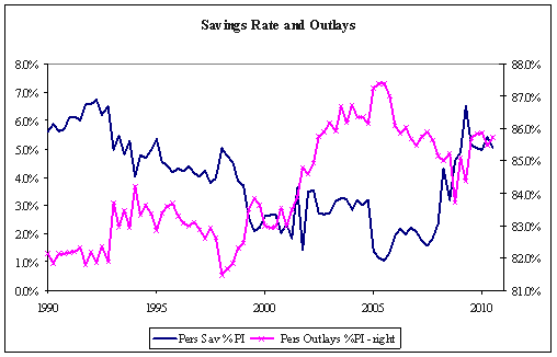
Figure 1 shows the longer trends in the savings rate and outlays – the savings rate has been trending lower for the past couple decades but with a sharp rebound starting in 2008. Spending has increased, with a particular jump about 2001. Figure 2 shows personal current taxes. This fell starting 2002 (the George W. Bush tax cuts), and then again starting in 2008 (in response to the recession). Taxes will no doubt rise at some point, in response to substantial government deficits.

Figure 1

Figure 1 – Savings Rate and Personal Outlays, as Percent of Personal Income

Source: Bureau of Economic Analysis and Author’s Calculations

Figure 2

Figure 2 – Current Personal Taxes, as Percent of Personal Income

Source: Bureau of Economic Analysis and Author’s Calculations

Posted in Musings, Past - archives | Tagged | Leave a comment

Personal Income and Consumption

Summary

July personal income figures released today show an increase in spending relative to income. This is not good news because the higher spending means savings rates are down and household de-leveraging and spending adjustments are not proceeding. Furthermore, revisions for the first and second quarter show higher spending than previously reported, implying that adjustment is occurring less fast than previously estimated.

In my view a robust recovery will occur when (and if) households have finished adjusting their spending to new, lower, levels of lifetime wealth. The 2008-2009 recession and the current recovery are all about households de-leveraging and adjusting spending levels downwards relative to income. I believe households still have some way to adjust, and perversely government stimulus (implemented to ameliorate the impact of the recession) may have simply delayed the process. Yes, savings rates have recovered dramatically from the lows of 2007. But most of the rise in savings rates has been due to tax cuts rather than lower spending. At some point taxes will have to rise to address fiscal imbalances, and households will likely adjust down spending in response.

Table 1 shows the current savings rate and spending rates, quarterly. The savings rate for the second quarter of 2010 is dramatically higher than for 2007, but almost all of the change in savings rate has been due to falling taxes rather than lower spending. Table 2 shows monthly figures, with July personal outlays as a percent of income rising slightly and savings rates falling.

Table 1

Table 1 – Savings Rate and Decomposition for 2008-2010

Table 2

Table 2 – Savings Rate and Decomposition Monthly 2010

There is no doubt trouble stored up for the future. Since the bubble burst in 2007-2008 all forms of wealth have fallen – falling housing prices have reduced real estate holdings; stock markets have fallen or stagnated; and, probably most importantly, employment and prospects for future earnings have fallen. The fall in lifetime wealth should naturally induce some adjustment in household spending. The recession was simply that adjustment of spending to new levels of perceived wealth.

I don’t think the imbalances that led to the financial crisis of 2007-2009 are fully redressed (at least in the US). Spending is supported by low taxes (an explicit government policy to ameliorate the recession of 2008-2009). Eventually taxes will have to rise to fund the government deficit, and this will put pressure on spending. Either the savings rate will fall (building future imbalances) or spending will fall (recession).

Longer-term trends (over the past two decades) are shown in figures 1 and 2:
• Savings rate (more accurately, what is left over from current spending) fell from roughly 6% of income to below 2% in 2007/2008 and has now rebounded to almost 6%.
• Taxes rose during the late 1990s but fell dramatically post-2000, and again in 2008.
• Spending has risen from about 83% of income (1990s) to over 87% in 2005 and is now roughly 85%. It is still high by historical standards and supported by low taxes, although not as high as during the bubble.

Household debt (measured in the Federal Reserve’s quarterly flow of funds reports) has fallen since early 2008, from 96.4% of GDP in QI 2008 to 93.6% in QIV 2009. This is good news and shows households have started de-leveraging. Unfortunately the increase in government debt has been far larger. According to the OECD, central government debt for the US grew by $2.5tn from 2007 to 2009, or from 35.6% of GDP to 53.1%. Future tax liabilities, which are a future liability and thus function as a sort of implicit household debt, have probably offset any decrease in directly-owned household debt. The net result is that household leverage has probably not decreased much, if at all, over the past three years.

Decomposition of Movements in Spending and the Savings Rate

Table 1 shows the savings rate. The definitions of savings and spending rates, together with a decomposition of savings as a percent of personal income, are discussed here.

Economists commonly consider the “savings rate,” which is the difference between current income and spending – the excess of income left after spending and taxes are accounted for. The definition is:

Savings Rate = (Disposable Personal Income – Personal Outlays) / Disp Pers Inc .

(This “savings rate” is not exactly savings as one usually thinks of savings, but rather a definition of the excess of income over spending in the aggregate economy. One could equally well talk of the “spending rate” – Outlays / Income – which is just one minus the “savings rate”.)

It is useful to decompose the rise in the savings rate in order to understand it a little more. To do so it is useful to consider savings as a percent of total personal income. Basically,

Disposable Personal Income = Personal Income – Personal Current Taxes
Savings = Disposable Personal Income – Personal Outlays

The standard definition of the savings rate is savings divided by Disposable Income:

Savings Rate (DPI) = (Disposable Personal Income – Personal Outlays) / Disp Pers Inc
= 1 – Personal Outlays / Disp Pers Inc

We can, however, define a savings rate divided by personal income that is only slightly different:

Savings Rate (PI) = (Personal Income – Personal Current Taxes – Personal Outlays) / Pers Inc
= 1 – Pers Curr Taxes / Pers Inc – Pers Out / Pers Inc

Since DPI and PI differ only by Pers Curr Taxes, which has monthly changes that are not large relative to the level of DPI and PI, the two measures will be very much the same. The advantage of the second is that we can decompose changes in that savings rate into changes due to taxes and that due to changes due to outlays (spending).
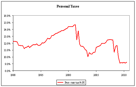
Figure 1 shows the longer trends in the savings rate and outlays – the savings rate has been trending lower for the past couple decades but with a sharp rebound starting in 2008. Spending has increased, with a particular jump about 2001. Figure 2 shows personal current taxes. This fell starting 2002 (the George W. Bush tax cuts), and then again starting in 2008 (in response to the recession). Taxes will no doubt rise at some point, in response to substantial government deficits.

Figure 1

Figure 1 – Savings Rate and Personal Outlays, as Percent of Personal Income

Figure 2

Figure 2 – Current Personal Taxes, as Percent of Personal Income

Posted in Musings, Past - archives | Tagged | Leave a comment

Personal Income and Consumption

Summary

Personal income figures released today are some of the best economic news to come out recently, contrary to what most commentators have claimed. The headlines report that spending and income has stagnated, but the real news is in the revisions and the fact that spending has not grown as much as previously reported. The downward-revised spending is good news because it provides evidence that households are adjusting to reduced wealth. There is still plenty of bad news – most of the increased savings rate is due to fiscal stimulus and when that stimulus is reversed we are likely to see a renewed recession – but the situation is better than we thought a month or two ago.

The revisions have been substantial and back to 2008. The most important was a downward revision in the overall level of spending (personal outlays and personal consumption expenditures). This flowed through to savings, implying an upward revision on the savings rate. Most notably, the revisions were larger for more recent months. This means that the increase in spending that had been reported in the past few months has now been revised to pretty flat spending.

This is all good news because, in my view, a robust recovery will occur when (and if) households have finished adjusting their spending to new, lower, levels of lifetime wealth. The 2008-2009 recession and the current recovery are all about households de-leveraging and adjusting spending levels downwards relative to income. Any evidence that the adjustment process is proceeding has to be good news because it signals that a robust and sustained recovery will be that much sooner.

The fiscal stimulus, both government spending and tax cuts, was a policy effort to offset the slow-down in spending. Perversely the policy may have simply delayed the process. Since the bubble burst in 2007-2008 all forms of wealth have fallen – falling housing prices have reduced real estate holdings, stock markets have fallen or stagnated, and probably most importantly employment and wage earnings have fallen. The fall in lifetime wealth should naturally induce some adjustment in consumer spending. The recession was simply that adjustment of spending to new levels of perceived wealth. A robust recovery will take hold when households are comfortable with their new level of spending relative to income.

Table 1 shows the current (revised) savings rate and spending rates, quarterly. The spending rate for the second quarter of 2010 is below where it was in 2007. Table 1b shows revisions. The level of spending has been revised down and savings up. Prior to the revisions the spending rate was reported as having increased substantially from 2008 through 2010.

Table 1

Table 1 – Savings Rate and Decomposition for 2008-2010

Table 1b

Table 1b – Revisions to Savings Rate and Decomposition

Source: Bureau of Economic Analysis and Author’s Calculations

The news from the data are not all good, by any means. Reduced taxes are the main source of the increase in the savings rate. The savings rate increased from the low of 1.6% to 5.7% (a change of 4.1 percentage points) but most of that (3.4 percentage points) was due to lower taxes – i.e. lower spending contributed little (0.7 percentage points).

There is no doubt trouble stored up for the future. I don’t think the imbalances that led to the financial crisis of 2007-2009 are fully redressed (at least in the US). Spending is supported by low taxes (an explicit government policy to ameliorate the recession of 2008-2009). Eventually taxes will have to rise to fund the government deficit, and this will put pressure on spending. Either the savings rate will fall (building future imbalances) or spending will fall (recession). Nonetheless the news is better than it was – prior to revisions spending actually increased and reduced savings.

Longer-term trends (over the past two decades) are:
• Savings rate (more accurately, what is left over from current spending) fell from roughly 6% of income to below 2% in 2007/2008 and has now rebounded to almost 6%.
• Taxes rose during the late 1990s but fell dramatically post-2000, and again in 2008.
• Spending has risen from about 83% of income (1990s) to over 87% in 2005 and is now roughly 85%. It is still high by historical standards and supported by low taxes, but not as high as during the bubble.

Household debt (measured in the Federal Reserve’s quarterly flow of funds reports) has fallen since early 2008, from 96.4% of GDP in QI 2008 to 93.6% in QIV 2009. This is good news and shows households have started de-leveraging. Unfortunately the increase in government debt has been far larger. According to the OECD, central government debt for the US grew by $2.5tn from 2007 to 2009, or from 35.6% of GDP to 53.1%. Future tax liabilities, which are a future liability and thus function as a sort of implicit household debt, have probably offset any decrease in directly-owned household debt. The net result is that household leverage has probably not decreased much, if at all, over the past three years.

Decomposition of Movements in Spending and the Savings Rate

Table 1 shows the savings rate. The definitions of savings and spending rates, together with a decomposition of savings as a percent of personal income, is discussed here.

Economists commonly consider the “savings rate,” which is the difference between current income and spending – the excess of income left after spending and taxes are accounted for. The definition is:

Savings Rate = (Disposable Personal Income – Personal Outlays) / Disp Pers Inc .

(This “savings rate” is not exactly savings as one usually thinks of savings, but rather a definition of the excess of income over spending in the aggregate economy. One could equally well talk of the “spending rate” – Outlays / Income – which is just one minus the “savings rate”.)

It is useful to decompose the rise in the savings rate in order to understand it a little more. To do so it is useful to consider savings as a percent of total personal income. Basically,

Disposable Personal Income = Personal Income – Personal Current Taxes
Savings = Disposable Personal Income – Personal Outlays

The standard definition of the savings rate is savings divided by Disposable Income:

Savings Rate (DPI) = (Disposable Personal Income – Personal Outlays) / Disp Pers Inc
= 1 – Personal Outlays / Disp Pers Inc

We can, however, define a savings rate divided by personal income that is only slightly different:

Savings Rate (PI) = (Personal Income – Personal Current Taxes – Personal Outlays) / Pers Inc
= 1 – Pers Curr Taxes / Pers Inc – Pers Out / Pers Inc

Since DPI and PI differ only by Pers Curr Taxes, which has monthly changes that are not large relative to the level of DPI and PI, the two measures will be very much the same. The advantage of the second is that we can decompose changes in that savings rate into changes due to taxes and that due to changes due to outlays (spending).

Figure 1 shows the longer trends in the savings rate and outlays – the savings rate has been trending lower for the past couple decades but with a sharp rebound starting in 2008. Spending has increased, with a particular jump about 2001. Figure 2 shows personal current taxes. This fell starting 2002 (the George W. Bush tax cuts), and then again starting in 2008 (in response to the recession). Taxes will no doubt rise at some point, in response to substantial government deficits.

Figure 1

Figure 1 – Savings Rate and Personal Outlays, as Percent of Personal Income

Figure 2

Figure 2 – Current Personal Taxes, as Percent of Personal Income

Source: Bureau of Economic Analysis and Author’s Calculations

Posted in Musings, Past - archives | Tagged | Leave a comment

Employment and Unemployment Flows

This is the summary of a 45-page paper (.pdf) available for download at SSRN

SUMMARY

Unemployment in the U.S. has risen dramatically since the start of the recession in December 2007, going from about 6.8 million people in May 2007 to over 14.6 million in June 2010. This is often spoken of as “losing 7.8 million jobs,” but this is a terribly misleading view of the issue. The reality is that 5 or 6 million jobs were lost each month, with a comparable (just slightly lower) number found each month. Employment and unemployment are dynamic, and to understand them we need to look at the competing forces, the flows in and out, that shape them. By examining the flows we gain a perspective that is not available if we examine only the levels of employment and unemployment.

The major conclusions are:

  • Dynamics: Employment and unemployment are hugely dynamic, with large flows in and out even during the current severe recession.
  • Employment: Declines during the recession have been largely due to decreased probability of finding a job. There has been very little impact from changes in the probability of losing a job.
  • Unemployment: Increases have been, not surprisingly, largely due to lower probability of finding a job and higher probability of losing a job to unemployment.
  • NLF: Not in the labor force (NLF) is enormously important. First, the monthly flows in and out of NLF are large. Second, higher propensity to move from NLF to unemployment is a significant contribution to higher unemployment and, surprisingly, contributes to an increase in employment (that partially offsets the overall decline). The changes in probability of moving between unemployment and NLF seem to look like an “anti-discouraged worker” effect – during the recession people are more likely to move from NLF to unemployment and less likely to move from unemployment to NLF.
  • Current Recession: The dynamics of employment and unemployment during the current recession do not appear qualitatively different from the recessions of the early 1990s and 2000s – the effects are significantly larger but qualitatively the same.

Particulars

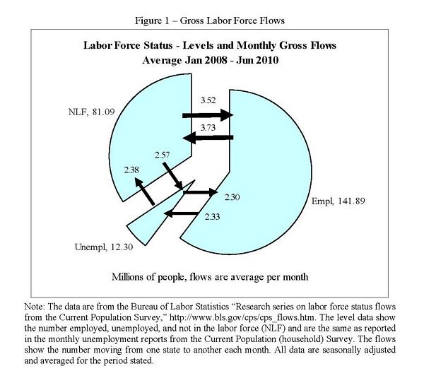
Figure 1 shows basic observations about employment and unemployment from the CPS (Current Population or household Survey). The pie represents the average level of employment, unemployment, and not in the labor force (NLF), number of people in millions for January 2008 through Jun 2010. The arrows represent the average of monthly flows.

The first thing to note is the large size of these flows. Consider unemployment. Figure 1 shows there were roughly 4.9 million people each month entering unemployment and roughly 4.7 million leaving, or almost 40% of the number unemployed. Employment is the same story. Flows in and out of employment according to figure 1 were about 6 million per month – even during the worst US recession in over 75 years. Unfortunately, there were more jobs lost than found each month, but this focuses our attention where it should be – what influences the flows in and out and how those flows determine the levels. Finally, the flows to and from not in the labor force (NLF). The size of the flows argue that the distinction between unemployed and NLF is somewhat artificial (many new employees come directly from NLF). We will see below that the economic significance of changes in NLF flows means we must account for NLF behavior to understand changes in employment and unemployment.

Gross Labor Force Flows

Figure 1 - Gross Labor Force Flows

There are reasons to think the data shown in figure 1 over-estimate the monthly flows. The evidence is that the over-estimation might be something like 5-20% for flows between employment and unemployment and 30-50% for flows in and out of NLF. Even allowing for such over-estimation, however, the flows are large, economically significant, and critical to understanding changes in employment and unemployment. Even allowing for over-estimation the flows in and out of unemployment are on the order of 3 million plus each month, and more than 4 million new jobs each month. In the end, whether the exact number of new jobs is 4.5 million or 5.8 million is irrelevant to the larger point – a significant number of people flow between labor force states each month.

As a mental model of unemployment we often use what I might call the “lump of proletariat” model of changing unemployment. Unemployment is like a bucket full of lumps of proletariat. Each month a lump is either added (unemployment goes up) or removed (unemployment goes down). In reality a better mental picture is the bathtub model – unemployment as a tub of water with an open spigot pouring water in and a pump briskly draining water out. The volume goes up by five gallons not because five gallons are added – it goes up because 115 gallons are added but only 110 are removed. The approach to understanding the bathtub is very different than understanding the bucket of proletariat. With the bucket we focus on the lump or the change in unemployment – how and why did 200,000 people come into unemployment this month? With the bathtub we focus on how many new entrants become unemployed compared with how many leave. We recognize that the tub is fuller by 200,000 people because 4.9 million entered but only 4.7 million left. We focus on why only 4.7 million left and where they went – we focus on the rate of entry and exit as the determinants of the level.

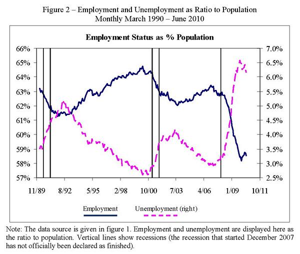
Figure 2 shows the history of employment and unemployment levels since 1990 (measured as a ratio to population to adjust for growth in population). The effect of the late 2000s recession is obvious: unemployment rose about 3.5 percentage points and employment fell about 5.2 percentage points.1

Figure 2

Figure 2 - Employment and Unemployment as Ratio to Population Monthlty March 1990 - June 2010

The monthly flows (as in figure 1) are what determine the levels of employment and unemployment. The flow data contain valuable information and insight into what drives the changes in employment and unemployment.2 The flows, however, can also provide a few surprises. For example, the flow u->e (from unemployment to employment) generally rises during a recession. Naively one might think that this means lower job-finding rates do not contribute to lower employment or higher unemployment, but as we will see shortly, the opposite is true.3

In analyzing the flows we need to look at the conditional flows or probabilities rather than the gross flows themselves. The conditional probabilities are the economically relevant variables. The flows are determined by people making individual decisions and we need to normalize by how many people there are making those decisions.4 From figure 1 we see there are six flows:

  • u->e: an unemployed person finds a job
  • n->e: a person not in the labor force (NLF) finds a job
  • e->u: an employed person loses a job and goes to unemployment
  • e->n: an employed person loses a job and goes to NLF
  • u->n: an unemployed person moves to NLF
  • n->u: an NLF person moves to unemployed

To decompose changes in employment and unemployment we analyze the steady-state levels implied by the conditional probabilities. Steady-state levels depend only on the conditional probabilities, so concentrating on the steady-state isolates the effect of changes in conditional probabilities. What makes focusing on steady-state useful is that the steady-state time-series matches the actual levels closely (particularly for unemployment), giving confidence that conclusions we draw from analysis of the steady-state apply to changes in observed levels.

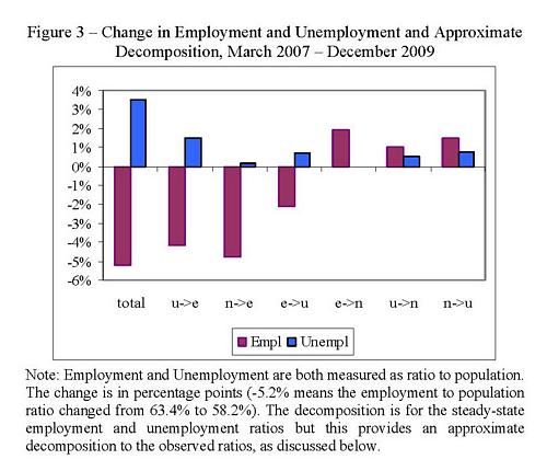
Figure 3

Figure 3 - Change in Employment and Unemployment and Approximate Decomposition, March 2007 - December 2009

Figure 3 shows the decomposition of changes in employment and unemployment for the recent recession due to changes in the conditional probabilities. The decomposition is only approximate (discussed more in the next section and the appendix) but it does provide a useful view into what drives the changes in employment and unemployment. The figure shows the total change in unemployment and employment (+3.5 and -5.2 percentage points) together with an approximate decomposition resulting from changes in the probabilities of moving between states. For example u->e shows the effect resulting from changes in the probability of finding a job conditional on being unemployed (moving u to e).

Employment fell by 5.2 percentage points

  • A fall in the probability of finding a job (u->e and n->e) was the biggest contributor. The impact from n->e (probability of finding a job when NLF) was slightly bigger than the impact from u->e
  • The probability of losing a job had almost no net impact. The probability of going to unemployment increased but the probability of losing a job to NLF decreased and these two offset.
  • Most intriguingly, changes in the probability of moving between unemployment and NLF contributed positively to employment. The probability of moving unemployed to NLF (u->n) decreased and the probability of moving NLF to unemployed (n->u) increased. These increased the level of unemployment relative to NLF; the higher probability of finding a job from unemployment (instead of NLF) increases the level of employment.

Unemployment rose 3.5 percentage points.

  • The biggest contributor was the fall in the probability of getting a job if unemployed (u->e)
  • The second biggest contributor was the increased probability of losing a job (e->u).
  • A fall in the probability of moving unemployed to NLF (u->n) and a rise in the probability of moving NLF to unemployed (n->u) both contributed, as mentioned above.

The changes to and from NLF had important effects:

  • The probability u->n went down and n->u went up, and this contributed positively to unemployment.
  • The fall in u->n and rise in n->u contributed positively to employment. The effect seems to be that unemployed job seekers work harder to find a job than do NLF job seekers. More unemployed people partially offsets the lowered probability of finding a job.
  • I interpret this as something of an “anti-discouraged worker” effect. Prior to the recession an NLF job-seeker might have found a job without searching hard and thus not reported themselves as unemployed. With the recession such a person is forced to search hard and thus are reported as unemployed.

This pattern of changes in flows during the 2007-2009 recession, and their impact on levels of employment and unemployment, matches well with that of the recessions of 1990-1992 and 2000-2003. All three periods exhibited the same pattern of changes in probabilities and the effect of these changes on employment and unemployment levels. What distinguishes the 2007-2010 recession is the magnitude of the changes, not their pattern. (Furthermore, adjusting the flows for possible over-estimation does not change these conclusions substantively.)


  1. This is for the period March 2007 to December 2009. This corresponds roughly to the trough-to-peak for unemployment, and starts somewhat before the official start of the recession in December 2010. Unemployment rose from 2.9% to 6.4% and employment fell from 63.4% to 58.2%.
  2. As mentioned above the flows are probably over-estimated. I continue to focus on the unadjusted flows because there is no ideal or generally-accepted method for adjusting the flows. In the detailed discussion below I do apply one method of adjustment, and find that the results do not change significantly.
  3. The flow u->e goes up because the conditional probability u->e goes down but the level of unemployment goes up so much that the flow u->e actually rises.
  4. The conditional probability of moving from one state to another is the actual flow (number of people) divided by the number of people starting in the original state – for example the number moving from employed to NLF (e->n) divided by the number starting in employment.
Posted in Economics, Publications and Papers | Tagged | Leave a comment

Managing a Sovereign Wealth Fund: A View from Practitioners

This chapter, co-authored with D. Darcet and M. du Jeu, is in Economics of Sovereign Wealth Funds: Issues for Policymakers, ed. U. S. Das, A. Mazarei, H. van der Hoorn, published by the IMF.

Posted in Miscellaneous, Publications and Papers | Tagged | Leave a comment