Natural Rate Vignette

16 December 2013

Link to .pdf

PEOPLE:
Milton Friedman, Edmund Phelps
RELATED:
Phillips Curve, Taylor Rule, Inflation as a Monetary Phenomenon
DATES:
Milton Friedman and Edumnd Phelps published this in various papers in 1967 and 1968.
CHICAGO:
Milton Friedman is one of the best-known economists to have taught at University of Chicago.

VIGNETTE

There is a long-standing belief among the general public and even professional economists that inflation and unemployment (or economic growth) are related – higher growth (lower unemployment) leads to higher inflation. Milton Friedman and Edmund Phelps, in a series of papers during the late 1960s, firmly and decisively critiqued this view. Economic theory says that in the long run there can be no trade-off between inflation and unemployment. There is a “natural” rate of unemployment, the equilibrium rate implied by real quantities – real wages, preferences, demand, production functions, and so on. In the short run the independence of unemployment and inflation may be obscured but in the long run this natural or equilibrium rate is unaffected by inflation.

Friedman and Phelps’s arguments had a significant impact on thinking among economists and policy-makers. And their arguments are as relevant today, in our world of quantitative easing and discussions of Federal Reserve policy, as they were in the 1960s.

The Natural Rate of Unemployment (the Non-Accelerating Inflation Rate of Unemployment or NAIRU) and the Phillips Curve

Prior to Friedman and Phelps’s work a central tenet among economists was that macroeconomic policy could trade off higher inflation on the one hand for higher growth and lower unemployment on the other. This was commonly termed the Phillips Curve, after the economist William Phillips who published a paper discussing the relationship between unemployment and wage changes.

Friedman presented his ideas in his presidential address to the American Economic Association (“The Role of Monetary Policy,” American Economic Review 1968) while Edmund Phelps discussed it in “Phillips Curve, Expectations of Inflation and Optimal Unemployment Over Time,” Economica 34, August 1967).

The naïve Phillips curve posits “a stable negative relation between the level of unemployment and the rate of change of wages – high levels of unemployment being accompanied by falling wages, low levels of unemployment by rising wages.” (quoted from Friedman’s 1976 Nobel address “Inflation and Unemployment”). The move from rising wages to rising prices in general is then easy to imagine. This posited relationship is superficially appealing because it seems like, with low unemployment, employers would have to raise wages. But it confuses nominal wages with real wages.

Friedman’s argument around the Phillips curve and the natural rate of unemployment was nicely elaborated in his 1976 Nobel address “Inflation and Unemployment”, and the argument was simple. At its core was the argument that unemployment depends on real wages but that inflation may obscure the pattern of real wages and changes in wages. The first part of the argument was that there is a “natural rate” or equilibrium rate of unemployment implied by real quantities – real wages, preferences, demand, production functions, and so on. The word “natural” in this context is not meant to have a normative meaning, nor is it meant to imply that it is unchanging. The term simply means the rate that will result from equilibrium in the markets. The natural rate has also come to be called the NAIRU or non-accelerating inflation rate of unemployment.

The second, and truly insightful part of the argument, was to show that unexpected inflation may push employers and workers from the natural rate, with positive inflation causing a lower unemployment rate – the classic Phillips curve. But most importantly, this effect is only temporary and is dependent on the inflation being unexpected. This was a powerful, in fact fatal, argument against the Phillips curve as a policy tool, a tool which could be used to “fine tune” the economy and exploit a trade-off between higher inflation versus lower unemployment.

To see the second part of the argument let us start by ignoring inflation. Consider an employer who experiences a rise in the price of his output relative to other goods – this effectively lowers the real wage and will induce an increase in the firm’s labor demand. Then consider an employee who experiences a rise in the wage relative to all other goods – this effectively raises the real wage and will induce an increase in labor supply.

So far this is straightforward price theory – labor supply and demand both depend on real wages, with demand going up when real wages go down and supply going up when real wages go up. But then Friedman applied a key insight – inflation can obscure changes in prices in just such a way that makes it seem that real wages go down for employers and up for employees. This induces employers to demand more labor, workers to supply more, and unemployment to go down.

Friedman’s argument that inflation can make real wages appear to go both down and up is simple although, on further consideration, it is a deep insight into the purpose and power of the price mechanism and the costs of inflation in obscuring and degrading the signals provided by prices.

When an employer experiences a rise in the price of his output he will take this, at least partly, as a rise in the real price of his output. Again, Friedman says it best (from his 1976 Nobel address):

In an environment in which changes are always occurring in the relative demand for different goods, he [the employer] will not know whether this change is special to him or pervasive. It will be rational for him to interpret it as at least partly special and react to it, by seeking to produce more to sell at what he now perceives to be a higher than expected market price for future output. He will be willing to pay higher nominal wages than he had been willing to pay before. … A higher nominal wage can therefore mean a lower real wage as perceived by him.

To workers the situation is different: what matters to them is the purchasing power of wages … over all goods in general. … A rise in nominal wages may be perceived by workers as a rise in real wages and hence call forth an increased supply, at the same time that it is perceived by employers as a fall in real wages and hence calls for an increased offer of jobs.

When prices change because of unexpected inflation, employers and workers cannot easily and quickly determine whether the change is a change in relative prices or absolute prices. Indeed, by its very definition unexpected inflation is not anticipated and employers and workers will tend to interpret (incorrectly) the change in the price level as a change in relative prices (real wages in this case) in just the way to increase employment above the equilibrium level and push unemployment below the equilibrium rate (the natural rate).

But employers and workers will not be fooled forever, probably not even for long. They will learn that the change in product prices and wages is not a change in real prices and wages but only due to inflation. We should expect the unemployment level to temporarily fall below the natural rate in response to unexpected inflation but then rise back. There will be a Phillips curve (unemployment goes down when inflation goes up) but it will be only a short-run effect.

If the inflation were fully anticipated, in fact, we should not expect any response of unemployment to inflation. This is why Friedman argued that any policy-maker attempting to exploit the short-run Phillips curve would have to generate not a steady level of inflation, but ever-accelerating and unexpected inflation.

Friedman’s analysis is as relevant today as it was in the 1960s. There is still discussion of the relation between price changes (inflation) and growth. There is a widely-held presumption that high growth (and low unemployment) are related to or cause inflation, while slow growth and high unemployment inhibit inflation because of “deficient demand” or “slack in the economy”. As for the original Phillips curve the argument is superficially appealing since it relates higher demand to increases in prices. Like the original Phillips curve, however, there is a tendency to conflate nominal prices and real price changes.

Posted in Uncategorized | Leave a comment

Permanent Income Vignette

16 December 2013

Link to .pdf

PEOPLE:
Milton Friedman
RELATED:
Consumption Smoothing, Lifecycle Consumption, Consumption Function
DATES:
Milton Friedman published A Theory of the Consumption Function in 1957.
CHICAGO:
Milton Friedman is one of the best-known economists to have taught at University of Chicago.

VIGNETTE

Changes in income can be thought of as either permanent changes or transitory changes. The key idea, and it is an hypothesis or theory that must be tested against evidence, is that households or individuals respond to permanent changes but not to transitory changes. An increase in income that is transitory will be saved and not spent.

Friedman developed and tested the permanent income hypothesis during the 1950s to address a very specific set of problems, the apparent contradiction between evidence from time-series and cross-sectional responses to changes in income. The concept of permanent versus transitory income, however, has become embedded throughout economics and remains as relevant today as it was over 50 years ago. How much consumers spend out of increased income was a vital question when governments undertook the substantial fiscal stimulus in response to the financial crisis of 2007-2008, and the question remains relevant today as governments consider fiscal austerity.

Consumption Function

The consumption function is an important concept in economic theory, Keynesian macroeconomics in particular. Introduced by J.M. Keynes in 1936 in The General Theory of Employment, Interest, and Money, it represents the relation between aggregate income and consumer spending. Keynes presumed the relationship was stable, or at least stable enough to act as the fundamental building block for the multiplier, the mechanism by which an increase in aggregate expenditure produces a larger increase in demand.

In its simplest form the consumption function would be a linear (technically affine) function:

c0 + c1 * Y

The coefficient c1 is the marginal propensity to consume and measures how much of each additional dollar of income consumers spend (versus save). Note that the coefficient c1 need not be a constant – it can depend on such factors as the level of interest rates, the average level of wealth, distribution of income and wealth across the population – but it is presumed to be fairly stable over time.

Empirical studies, however, soon showed some important and challenging inconsistencies, particularly between observations from cross-sectional or household-level studies on the one hand and time series or aggregate data on the other. When examining behavior across individuals or households at a point in time, economists found that consumers with higher incomes saved more and their consumption showed a much less than one-for-one response – from an extra dollar of income only a small portion was consumed and a large fraction was saved. And yet analysis revealed a different trend when they examined aggregate data over long time spans or across countries with widely differing incomes. Economists found a roughly constant share of national income being saved, in other words consumption increased in line with income. The cross-sectional observations appeared to be inconsistent with both the aggregate observations and with the assumptions behind the Keynesian consumption function.

Permanent Income

Friedman showed that the Keynesian foundations of the consumption function were fundamentally flawed. His explanation was as simple as it was brilliant; his own words provide the simplest explanation:

The central theme of this monograph can be illustrated by a simple hypothetical example. Consider a large number of men all earning $100 a week and spending $100 a week on current consumption. Let them receive their pay once a week, the paydays being staggered, so that one-seventh are paid on Sunday, one-seventh on Monday, and so on. Suppose we collect budget data for a sample of these men for one day chosen at random, defined income as cash receipts on that day, and defined consumption as cash expenditures. … It may well be that the men would spend more on payday than on other days but they would also make expenditures on other days, so we would record the one-seventh with an income of $100 as having positive savings, the other six-sevenths as having negative savings. Consumption might appear to rise with income, but, if so, not as much as income, so that the fraction of income saved would rise with income. [Chapter 9 of A Theory of the Consumption Function, Princeton University Press, 1957]

So we have cross-sectional data showing that those with higher incomes save more and that the ratio of savings to income rises with income (the ratio of consumption to income declines). But in reality there is no savings (considering all the men together) and presumably if the incomes for all these men rose from $100 to $120 they would all consume $120 and there would still be no savings overall. In other words, at the aggregate level there would be no tendency for savings to rise with income and the propensity to consume out of income would be one.

Friedman’s hypothesis was that many of the puzzling and inconsistent results regarding savings and consumption were simply a result of “inappropriate concepts of income and consumption.” In the example of staggered paydays, individual savings rise and the ratio of consumption to income declines with rising income only because we are measuring daily income. If we used an appropriate measure of income, weekly income in the simple example, then there would be no rise in savings with income, and consumption (the ratio of consumption to income) would not change with income.

Building on the idea behind the simple example, Friedman introduced the concept of permanent income as distinct from the measured income reported by individual consumers or measured at the aggregate level. Although difficult to define, we might think of permanent income as corresponding roughly to the long-term expected income or lifetime income or wealth. As Friedman states, “the concept of permanent income is easy to state in these general terms, hard to define precisely.” In the example above the analogue of permanent income would be individuals’ $100 weekly income. Measured income would be either $100 or $0, depending on which day we measure an individual’s income.

The difference between measured income and permanent income is transitory income:

measured income = permanent income + transitory income .

Friedman’s central hypothesis can now be simply stated, in two parts. First, consumers respond to changes in permanent income but largely ignore changes in transitory income. Second, measured income is a combination of both permanent and transitory income.

The result is that any attempt to relate consumption to measured income will not measure a behavioral relationship but a statistical artifact. Say that transitory income is a large component of measured income, as will likely be the case when examining individual household income for a large number of differing households. Some will have low income because they have low income year-after-year, but some will simply have a poor year (unemployment, a poor bonus, or some other bad luck). Similarly some will have high income because of unusually good luck, purely transitory reasons.

Among households with high measured incomes, there will be a large portion with high transitory income and these households will not increase their consumption in response to the transitory income. So the measured consumption will not rise with measured income, or more accurately will do so much less than it would versus permanent income.

Consider, in contrast, a situation where transitory income is a small component of measured income. In this case consumption would be expected to rise much more with income because a rise in measured income would represent primarily a rise in permanent income. This would often be the case for aggregate data because across the whole economy there would be households with both high and low transitory income and the transitory component would tend to average out across households. Changes over the years in measured aggregate income would thus tend to reflect primarily changes in permanent income.

This simple hypothesis can, at least conceptually, account for the seeming inconsistency of the cross-sectional and the time series observations. Across households at a point in time, those households with higher measured income tend to have a large component of higher transitory income, and consumption will generally not go up with transitory income. This means the cross-sectional response of consumption to higher measured income will be relatively small (the marginal propensity to consume is low; the ratio of consumption to income goes down as income goes up; the savings rate goes up as income goes up).

For aggregate income (averaging or aggregating across households at a point in time) the transitory income will tend to average out, so measured aggregate income and changes in aggregate income over time will tend to measure permanent income. This implies that for long time spans using aggregate income, the response of consumption to income will be higher than for cross-sectional observations.

This idea was not completely new – it can be traced back to the writings of the one of the Bernoulli clan in the 18th century. Friedman’s genius, however, was two-fold: First in taking this simple idea and fully exploring and exploiting its implications; and second in collecting empirical evidence and using that evidence to truly test the theory, both marshaling evidence in support of the hypothesis but also searching for evidence that would disprove it.

Friedman believed that ideas and hypotheses had to be put up against data. The hypothesis alone, the fact that in theory it could explain the difference between the cross-sectional and the time series data (the microeconomic and the macroeconomic data) was not sufficient – a useful economic theory must be able to account for the quantitative observations. Much of A Theory of the Consumption Function was dedicated to measuring and testing the data to determine whether the permanent income hypothesis could in fact account for the differences between the microeconomic and macroeconomic data.

Permanent Income Today

Friedman’s concept of permanent income remains powerful and relevant today. How much consumers spend out of increased income was a vital question when governments undertook the substantial fiscal stimulus in response to the financial crisis of 2007-2008, and the question remains even more relevant today as governments consider fiscal austerity. The justification for fiscal stimulus is that during a recession every $1 of government spending or tax cut would create $1 or more of economic growth – the so-called fiscal multiplier. The worry during a period of fiscal austerity is that the reverse will occur – every $1 of government spending cuts or increased taxes will cut growth.

The justification behind the fiscal multiplier is that government spending or tax cuts will increase consumer income, consumers will spend out of that increased income, leading to further increases in income, further spending, and so on. But the critical question is how much consumers will actually spend out of the increased income – a large portion (a high propensity to consume and low propensity to save) will lead to a larger multiplier. And so we return to the concept of permanent versus transitory income, asking whether consumers treat the increased income from government stimulus as permanent or transitory – because if it is transitory the propensity to consume will presumably be small.

Posted in Uncategorized | Leave a comment

Human Capital Vignette

Link to .pdf version

PEOPLE:
Gary Becker, T.W. Schultz, Jacob Mincer, and many others
RELATED:
Economics of the Family; Household Production
DATES:
Gary Becker published Human Capital in 1964
CHICAGO:
Gary Becker earned his PhD from Chicago in 1955. After teaching at Columbia from 1957 to 1968 he returned to Chicago where he remained until his death in 2014

VIGNETTE

The idea of human capital so thoroughly pervades economic discourse that it can be hard to imagine a time when it was not central to our thinking as economists. And in some respects it has always been part of economics: Adam Smith in Wealth of Nations “identified the improvement of workers’ skills as a fundamental source of economic progress and increasing economic welfare.” (Sherwin Rosen in The New Palgrave Eatwell et al. [1987]). But it is undoubtedly Gary Becker who brought together the ideas that we know today as human capital and ensured its central role in economic thought.

The central idea of human capital is simple, indeed so simple that today it is almost self-evident:

  • As human beings our current skills and capacities are a capital stock, the result of prior investments by ourselves and others
  • Current earnings and other benefits are the returns or payments we earn based on those prior investments.

The idea is simple and simply stated but the implications flow to labor economics, macroeconomics, development, economic history – indeed all corners of economic thought.

There are two related results from viewing skills as a capital stock:

  1. Decisions over time are critical and we must consider any current decision in the context of past investment and future potential returns
  2. Human beings and everything around them are dynamic and malleable – static views of the world are not appropriate

So let us consider a little more carefully what we mean by human capital and what are the implications.

What is Human Capital

Skills and knowledge take time to develop and accumulate. Learning to play the piano takes time and practice. Learning calculus takes time and effort. Learning to ski is slow and difficult. Even growing to maturity takes time and requires investment in nutrition and health care. Virtually none of our skills or attributes comes immediately or for free. Every component of ourselves as humans requires decisions where we weigh future benefits versus present costs. This is such an obvious part of the human condition that we hardly give it a second though and we make such investment decisions every day of our lives. But until Gary Becker brought the issue to the fore it was not a central tenet of economic thinking.

And yet there are profound implications to the the dual facts that, first, we can change our skills and attributes but that, second, doing so is a slow and costly process. The malleable and mutable nature of human skills means that “labor” is not a fixed input but will vary both across people at a point in time and across time for individuals and nations. The “average worker” today is quite different from the average worker in 1850 – more skilled, better trained, even taller and stronger.

Similarly, the fact that investment today brings rewards in the future means that the past, the present, and the future are linked in fundamental but measurable ways. Today’s decisions are constrained by the past investments that produce today’s stock of capital. In turn today’s decisions are shaped by future prospects through comparing the present value of future benefits versus present costs (both direct costs and foregone benefits).

Capital theory has a long history in economics. One could argue that finance is nothing more than calculating and comparing present values for alternative investments. In a sense human capital theory adds nothing new; the tools and ideas for analyzing capital investments have been with us for a long time and once we recognize that our skills and attributes are indeed a capital stock then the transition to human capital is natural.

There are two factors, however, that makes the analysis of human capital different from physical capital. The first is relatively simple and not fundamental: in practice human capital cannot be bought and sold, only rented. The stock of capital is innately tied to the individual who accumulates it and the benefits from that stock will accrue to the owner. The second factor is less concrete and far more important: the power and value of human capital theory is not in the idea itself (which is relatively straight-forward) but in the myriad applications and implications for human behavior that we can infer from the theory and test with evidence.

Physical capital is really just an intermediate good for the production of yet other goods – an input into a production process that produces items we actually care about. Human capital, in contrast, is both an input into the production process and a consumption good itself. And since we as humans undertake so many activities, human capital enters into multiple and crucial production processes: physical production of goods and services through paid and non-paid work; consumption of leisure through home production; children through families. Indeed, once we view our skills as a capital stock then it is natural to view much of what we do in our lives as production processes with our own and others’ human capital as a crucial input.

A Brief History of Human Capital

Gary Becker did not invent human capital in 1964. Some writers trace early ideas back to William Petty who in 1676 “compared the loss of armaments, machinery, and other instruments of warfare with the loss of human life” (Rosen in “Human Capital”, The New Palgrave Eatwell et al. [1987]). Adam Smith in The Wealth of Nations pointed out that workers’ skills are a crucial source of economic growth. Alfred Marshall discussed the long-term features of human capital investments and the importance of the family. Frank Knight pointed out the role of increases in the stock of knowledge in overcoming diminishing returns when considering economy-wide growth.

A key contribution was the study of economic growth and national accounts, particularly work by T.W. Schulz and Edward Denison in the 1950s and 1960s. They were interested in the sources of economic growth and the fact output grew more than could be explained by growth in inputs of raw measures of capital and labor. They attributed much of this unexplained residual to technical change and in improvements in the quality of inputs. For capital such improvements are naturally attributed to investment and accumulation of a “capital stock.” It was natural to carry some of the same ideas over to labor inputs. As Rosen says (in “Human Capital”, The New Palgrave Eatwell et al. [1987]) “John Kendrick … demonstrated that the rate of return on these inclusive human capital investments is of comparable magnitude to yields on non-human capital. This line of research as a whole proves that an investment framework is of substantial practical value in accounting for many of the source of secular economic growth.”

It was Gary Becker, with Human Capital published in 1964 (Becker [1993]), who solidified the conceptual framework that we all now use in thinking about human capital. Becker structured his framework around the rate of return on investment, with individuals comparing the discounted present value of earnings streams resulting from alternative choices. In this respect human capital theory differs not at all from physical capital decisions. The differences arise in the applications.

Human Capital Applications

I want to briefly consider three applications of human capital: Schooling and Lifetime Earnings; Household Production; and Investment in Children. These three are important but only provide the briefest of introductions.

The related areas of labor market earnings, lifetime earnings profiles, and schooling choices are one of the iconic applications of human capital theory. Schooling has both direct costs and opportunity costs of foregone earnings. The benefit of schooling is in higher future earnings. The first implication of this view is that the focus must be on the intertemporal nature of life-cycle decisions rather than simple point-in-time comparisons. A doctor aged 45 does earn more than a construction worker, but part of those higher earnings is compensation for the costs (direct costs plus foregone earnings) that the doctor paid during earlier years of training. Earnings profiles for skilled occupations that require substantial investment should be steeply upward sloping, with part of the higher return in later years simply compensating for earlier costs.

With schooling, a second implication of the human capital approach is that individuals should invest in schooling until the marginal internal rate of return equals the rate of interest. This is the classic investment problem, the same condition as for felling a tree. When we observe differences across individuals in schooling choices (and subsequent earnings profiles) we have to recognize that at least some part is simply equalizing differences on costs of schooling (direct costs and foregone earnings). In the limit where all individuals are identical, in equilibrium the higher earnings of individuals with more schooling simply cover the costs of the extra schooling. This has important implications for examining earnings inequality because some portion of the distribution is simply compensation (in equilibrium) for differences in costs.

A second application of human capital ideas is to household production and time allocation. A central tenet of the theory is that human capital (the stock of skills and attributes) enters into the firm’s production function; “labor input” is measured by the type and quantity of human capital rather than simply the number of bodies. Once we have made the conceptual leap to human capital as an input to a firm’s production function, it is a short step to consider production of consumption goods with inputs of human capital, physical capital, and time.

As consumers we do not simply buy our consumption goods, things such as “dinner” or “leisure reading” or “skiing”. We produce those goods with inputs of purchased market goods (chicken or Dickens’s Great Expectations or lift tickets at Alta) combined with our human capital (skills in cooking or literacy or expertise in skiing) and, importantly, our time. Becker developed this idea in a seminal 1965 paper and later papers (Becker [1965], Ghez and Becker [1975]) and this approach has been very productive. It has allowed us to bringing to bear a set of tools and ideas from the theory of the firm, and has pushed us to consider issues such as substitutability versus complementarity of inputs in production; returns to scale in home production; public goods and externalities in the family.

The home production approach has been valuable in thinking, for example, about matching and marriage. When consumption goods and service are the result of joint production by a couple then there will be some services that benefit from substitutability (one partner may balance the home accounts, the other might do the grocery shopping) but others that benefit from complementarity (enjoyment is enhanced when both partners enjoy going to the theater or travel). When substitutability is more important then partners will tend to have different skills and attributes. When complementarity is more important (and empirically this seems to be the case) then individuals will choose partners with similar interests, background, socioeconomic status, and education. The apparent dominance of complementarity in household production and the resulting similarity in partners has important implications, tending to dampen cross-generational mobility by matching high-skilled with high-skilled partners and low-skilled with low-skilled.

Changes in household production over time can also have important implications. For example, it appears that introduction of labor-saving devices, and consequent changes in the implicit value of time is one important contributor to long-run changes in female labor force participation. Secular shifts in the production function have provided opportunities for women to shift from unpaid household work to paid market activities as the productivity of an hour spent at home has changed.

One final and, to me, fascinating example of applying the idea of investment in human capital is to fertility and family size: the quantity-quality tradeoff in child-rearing. The “demographic transition” is well-known: a country’s transition from high birth and death rates to lower birth and death rates with development and rising household incomes. From a human capital and household production perspective this makes sense. In a primarily subsistence agrarian society large family size is valuable, providing both manual labor in production and support of parents in old age. Furthermore, high infant mortality requires high fertility to actually attain large family size. In such an environment it makes sense (economically) for families to invest more in the number of children rather than the quality (education and other attributes) of each child.

In an industrialized and specialized economy, however, there are high returns to human capital. Inasmuch as parents can benefit from their children’s higher earnings, there will be an incentive for parents to invest in human capital – education, health, and other attributes that we associate with “quality” rather than “quantity”.

Conclusion

This has been nothing but a very brief introduction to the ideas of human capital. And we should not claim too much – human capital does not explain everything. Marriage is not only about substitutability versus complementarity of partners’ skills in household production. Female labor force participation is about more than labor-saving devices. Family size is about more than quality versus quantity tradeoffs. But without the organizing structure of human capital we would be missing crucial components of the story. Human capital allows us to apply economic thinking to a wide range of human activity.

References

   Gary S. Becker. A Theory of the Allocation of Time. The Economic Journal, 75(299):493–517, 1965. ISSN 0013-0133. doi: 10.2307/2228949. URL http://www.jstor.org/stable/2228949.

   Gary S Becker.  Human capital: a theoretical and empirical analysis, with special reference to education. The University of Chicago Press, Chicago, 3rd ed. edition, 1993. ISBN 0226041204 (pbk.). original-date: 1964.

   John Eatwell, Murray Milgate, and Peter Newman, editors. The New Palgrave: A Dictionary of Economics. Macmillan Press Limited, 1987.

   Gilbert R. Ghez and Gary S. Becker.  The allocation of time and goods over the life cycle. National Bureau of Economic Research: distributed by Columbia University Press, New York, 1975. ISBN 0-87014-514-2.

Posted in Economics, Vignettes | Leave a comment

JP Morgan “London Whale” series by Lisa Pollack

I discuss the JP Morgan “London Whale” credit derivatives trading loss in my “Practical Risk Management Course” at the University of Chicago Booth School of Business. I found Lisa Pollack’s discussion of the background and details invaluable. The following is my guide for students (and myself) to her FT Alphaville blog posts.

THE BELLY OF THE WHALE SERIES
Lisa Pollack, Financial Times Alpahville Blog

This is a really fun series of pieces by Lisa Pollack from the FT in 2013, covering the London Whale fiasco. By the end of the course you will be able to understand virtually everything she is talking about.

Lisa dug through JP Morgan’s Task Force report and the US Senate’s Permanent Subcommittee on Investigations report to provide some of the most amusing and insightful analysis I have seen. Here is my outline and guide to the posts – they are all there on the FT Alphaville site but a guide can be valuable for navigating around. (And this is only for her “Belly of the Whale” series – there is also the CSI: CIO series that came before – a link to that is at the bottom).

You will need to register for the Financial Times to read the blog, but the Alphaville blog is free content.

Now, as she says, “let’s dig in …”

The Senate’s Permanent Subcommittee on Investigations spent several months looking into the credit derivatives trades placed by JPMorgan’s chief investment office. The trades ultimately lost the bank $6.2bn. The resultant report, and exhibits associated with a hearing in the US Senate on March 15th [2013], has provided a great deal of background information previously unavailable anywhere else. We dig in…
  1. Its purpose limited only by one’s imagination…
    • “What was the SCP meant to be doing?”
      • General discussion of the role of the Structured Credit Portfolio (SCP)
      • From Senate subcommittee: “While some evidence supports that view of the SCP [intended generally to offset some of the credit risk that JPMorgan faces], there is a dearth of contemporaneous SCP documentation establishing what exact credit risks, potential losses, or tail risks were supposedly being hedge by the SCP.”
    • http://ftalphaville.ft.com/2013/03/19/1427912/its-purpose-limited-only-by-ones-imagination/
  2. Humongous credit derivatives cake proves inedible
    • Argues that SCP was more prop trading than hedging. Touches (once again) on contradictory goals for SCP. Discusses positions put on during 1st quarter 2012 in IG.9, Markit ITraxx Europe indices, and in tranches.
      • A very useful table from Senate report showing positions (notional) for quarter-end. Not detailed by series, but shows which index and indices vs. tranches. The increase in long IG and short HY index positions during Q1 is clear.
    • http://ftalphaville.ft.com/2013/03/19/1428102/humongous-credit-derivatives-cake-proves-inedible/
  3. 03/23/2012 06:20:09 BRUNO IKSIL, JPMORGAN CHASE BANK, says: i did not fail
    • This is the key post that shows the dynamics and psychology of the SCP strategy going bad. Narrative for January, February, March 2012 focusing on Bruno Iksil (“the London Whale”)
      • Lays out reporting lines (using Senate Staff Report exhibits)
      • Describes how the long IG positions were not producing the expected profits during January. (At one point Iksil suggests letting book run off, but then also mention that VaR and CSBPV / CS01 limiting adding more positions.)
      • Then in February longs were increased, seemingly for two reasons:
        • To offset (hedge) the HY short positions that were losing money but which the traders did not want to trade out of (cost too much).
        • To “defend p&l” – i.e. “keep trading in order to not get even deeper into the red.”
        • But this makes no sense at all. They should have had a liquidity reserve of mid-to-bid/offer (like at TMG) that would have been released when they traded out. This would have removed the disincentive to hold onto their position rather than trade out.
      • Passing mention (expanded in next post) about increasingly-aggressive marks during March.
      • March – “doubling-down” – increased long IG positions – now in IG.17 and IG.18. See “Correlation: the credit trader’s kryptonite” from the CSI:CIO series.
      • Really useful table (from Staff Report) on April 9th notionals vs. daily trading volumes.
    • http://ftalphaville.ft.com/2013/03/19/1428372/03232012-062009-bruno-iksil-jpmorgan-chase-bank-says-i-did-not-fail/
  4. This is the CIO! Take your silly market-making prices and [redacted] – Part 1
    • Talks about marks on the book but more narrative than numbers. Points out there were three valuable warning signs: Breach of risk limits (breaches ignored), Marks on the book (book mismarked), Collateral disputes with numerous counterparties. None of these warning signs triggered meaningful action.
      • Two valuable tables (end-February and end-March) that show bid / offer / CIO mark for various indices and tranches held by the CIO, and where the CIO took bid vs. offer. This shows pretty definitively that the marks were all slanted to minimize losses for the SCP book.
        • Question – what are the units for the various indexes? All spreads in bp? Or some prices? It looks like at the HY are prices (labeled, plus look like 16ths)
      • Explains how SCP behaved more like a buy-side client in an illiquid market
        • Taking traders’ marks for end-of-day marks
        • Having mid-office or back-office verify marks within thresholds
        • My question – were these markets truly illiquid? Particularly for big indices like NA.IG.9?
        • Standard for a dealer book in a liquid market – traders have nothing to do with marks, mid-office or back-office gets external marks. (And this is the way we ran our hedge fund, even though we were “buy-side”.)
      • There is mention about $17m adjustment for end-March marks, but cf post “Can Haz Spredshetz” under the “CSI: CIO” series. That subsequently grew to $400-600mn. There here were process and spreadsheet problems with the Valuation Control Group’s price-testing practices.
      • See post 6 below (“I thought, I thought …”) for much more detail, with numbers and tables, on problems with marks.
    • http://ftalphaville.ft.com/2013/03/21/1433822/this-is-the-cio-take-your-silly-market-making-prices-and-redacted-part-1/
  5. This is the CIO! Take your silly market-making prices and [redacted] – Part 2
  6. “I thought, I thought that was, that was not realistic, you know, what we were doing” – The London Whale
    • Detail on marks and mismarking.
      • “By now, it should be well understood that the credit derivatives book in JPMorgan’s chief investment office was woefully mismarked.”
      • “At March 31, 2012, the sensitivity to a 1bp move in credit spreads across the investment grad and high yield spectrum was approximately ($84) million, including ($134) million from long risk positions, offset by $50 million from short risk positions.” This means roughly $184/bp to mismarking (i.e. if longs mismarked down by 1bp and shorts mismarked up by 1bp)
      • An aside – Lisa objects to JPM changing a mark by 1.75bp but that strikes me as not a huge change in a mark, but rather a reflection of the position sizes being so large (since a moderate change in mark has a very big dollar impact).
      • Grout spread-sheet with totals for mismarking for mid-March.
      • Rather disjointed (and sad) conversation between Bruno Iksil and his boss Martin-Artajo.
      • Question – in Grout spreadsheet showing mismarking what are the units for CDX.HY? Does 0.34 mean 0.34bp? Or is that in price terms (i.e. 34 cents)?
    • http://ftalphaville.ft.com/2013/03/22/1435372/i-thought-i-thought-that-was-that-was-not-realistic-you-know-what-we-were-doing-the-london-whale/
  7. Risk limits are made to be broken
    • All about risk limits
      • Great graph of CSBPV showing change from roughly +/- $5mn through 12/11 to -$60mn by end-April.
      • Quote from Senate staff report (attributed to CEO Jamie Dimon and others): “risk limits at CIO were not intended to function as ‘hard stops,’ but rather as opportunities for discussion and analysis.” I believe this is actually a reasonable approach, but in fact breach of limits did not trigger any discussion or analysis.
      • A few tables detailing breaches of limits of all kinds, from January through April, of VaR, CSBPV, etc. Really pretty bad.
      • Also stop-loss limit breaches (but these were towards end-March, partly because book was mismarked so losses did not show up).
      • Risk limits were supposed to be reviewed annually or semi-annually. CIO did not perform such reviews.
    • http://ftalphaville.ft.com/2013/04/08/1450082/risk-limits-are-made-to-be-broken/
  8. Ten times on the board: I will not put “Optimizing regulatory capital” in the subject line of an email
  9. This is the VaR that slipped through the cracks
    • Primarily concerned with the introduction of new VaR model for the CIO during January 2012.
      • CIO was in breach of VaR limit, and it was so much that it put the whole bank in breach of VaR limits.
      • Documentation of some of the emails authorizing temporary waiver of the VaR limit, and push to get new VaR model authorized.
      • A few specific issues re VaR model:
        • Old VaR model was supposed to produce 5% VaR – P&L should exceed that level roughly 5 days out of 100. But P&L actually did not exceed once in a year. Patrick Hagan (developer of new VaR model) explained that this was a problem, essentially invalidating the the old model. Lisa Pollack comments after Hagan’s explanation: “[Skeptical-about-sample-size face goes here]” but this is one case where she is wrong: If p=0.05 that VaR=X, then P[no observations during a year > X] = 0.95^250 = 0.00027% – pretty small. We can use Bayes’ rule to see how much this might change my confidence in the original model. If my confidence is 99.9% that X is indeed the 5% quantile (the model is correct) vs 0.1% that X is, say, the 0.4% quantile, then P[X is 5% quantile | no observations during a year] = (.0000027*0.999) / (.0000027*0.999 + 0.36714*0.001) = 0.73%. In other words the evidence should change my prior from 99.9% to 0.73% – a really big impact on the prior probability.
        • There was no parallel run between old and new VaR models
        • The new VaR model lowered the VaR by roughly 50% instead of the expected 20%. This may seem like too much but for reference think that for a normal distribution the 5% quantile (-1.64) is 62% below the 0.4% quantile (-2.65). (The 0.4% quantile is a relevant reference because P[no exceedances of the 0.4% quantile during 250 business days] = (1-.004)^250 = 0.367. This is not too high a probability so maybe the model produces the 0.4% quantile.)
    • http://ftalphaville.ft.com/2013/04/10/1455152/this-is-the-var-that-slipped-through-the-cracks/
Lisa wrote an earlier series of blog posts (the CSI: CIO Series) that you can find at http://ftalphaville.ft.com/2013/01/16/1339792/jpm-task-force-stunningly-arrives-at-same-conclusion-as-jpm-chairman-and-ceo/
Posted in Risk Management | Tagged , , | Leave a comment

Lamia Gurdleneck – “it’s what you do with the figures that matters”

In the frontispiece of my risk management books I have a quote that sums up a fundamental truth about quantitative risk management:

It’s not the figures themselves, it’s what you do with them that matters”

I included the quote because it does express a fundamental truth, a motto by which we should all live. But also because it is something of an inside joke among statisticians: Maurice G. Kendall and Alan Stuart quote the passage in volume 2 of The Advanced Theory of Statistics from 1979, ascribing it to K.A.C. Manderville and a book titled The Undoing of Lamia Gurdleneck. But neither Manderville nor the book actually exist – they are the creation of Kendall and Stuart.

In writing my book I tried to track down the source of the quote (reproduced in its entirety below), looking for the author or the book. Nothing. Until one site pointed out that the name of Lamia Gurdleneck is an anagram of Maurice G. Kendall and Sara Nuttal (Lamia’s aunt) an anagram of Alan Stuart. And K.A.C. Manderville an anagram of Mavrice Kendall – substituting a “v” for “u”. It is all a joke of Kendall and Stuart’s.

Although we can applaud Kendall and Stuart for their sense of humor we should also remember that they created Lamia for a reason – because it is what you do with the figures that matters.

“You haven’t told me yet,” said Lady Nuttal, “what it is your fiancé does for a living.”

“He’s a statistician,” replied Lamia, with an annoying sense of being on the defensive.

Lady Nuttal was obviously taken aback. It had not occurred to her that statisticians entered into normal social relationships. The species, she would have surmised, was perpetuated in some collateral manner, like mules.

“But Aunt Sara, it’s a very interesting profession,” said Lamia warmly.

“I don’t doubt it,” said her aunt, who obviously doubted it very much. “To express anything important in mere figures is so plainly impossible that there must be endless scope for well-paid advice on how to do it. But don’t you think that life with a statistician would be rather, shall we say, humdrum?”

Lamia was silent. She felt reluctant to discuss the surprising depth of emotional possibility which she had discovered below Edward’s numerical veneer.

“It’s not the figures themselves,” she said finally, “it’s what you do with them that matters.”

— Ascribed to K. A. C. Manderville, The Undoing of Lamia Gurdleneck, in Maurice G. Kendall and Alan Stuart, The Advanced Theory of Statistics, Volume 2 (1979, frontispiece).

Posted in Miscellaneous, Risk Management | Leave a comment

Milton Friedman’s Scientific Legacy

I wrote the following for the celebration of Friedman’s centenary by the Becker Friedman Institute in November 2012.

By any measure, Milton Friedman has had a tremendous impact on our world. Friedman is one of the most recognizable economists of the 20th century. He is known to millions for Free to Choose, the book (with Rose Friedman) and television series; for his 19 years of Newsweek columns; for his 1976 Nobel Memorial Prize in economics. He was an untiring advocate of economic freedom, free markets, economic liberalism, and “the small man”.

But the source of Friedman’s continuing influence lies in the power of his ideas – ideas built on the twin pillars of sound economic theory and careful empirical analysis. History tells us that ideas matter–and that ideas have the power to change our world. And Friedman’s ideas have changed the way economists, the way we all, approach our world. As Friedman himself said, the function of economists is to provide a “stockpile of ideas” – to make available solutions when a crisis arises. And Friedman has provided an abundance of ideas.

Any discussion of Friedman’s legacy must include his lasting influence on both the economics profession and on the wider world. Both result from his profound and deep contributions to economic theory, methodology, empirical analysis, and economic history. By all accounts, Friedman was a powerful intellect and formidable opponent. But he was principally a scientist who took seriously the goal of understanding the world around him, and who rigorously challenged his own and others’ ideas with empirical evidence. Friedman himself seemed most proud of his intellectual contributions: “The thing I will really be proud of is if some of the work I have done is still being cited in the textbooks long after I am gone.”

Consumption Function
Ideas that Friedman developed and championed have become part of the economist’s lexicon. And these ideas continue to have importance and relevance to all of us today. Start with A Theory of the Consumption Function, Friedman’s landmark 1957 book and a work that was cited by the Nobel committee in awarding Friedman the 1976 Nobel Memorial Prize in Economic Sciences.

The consumption function is an important concept in economic theory, Keynesian macroeconomics in particular. Introduced by J.M. Keynes in 1936 in The General Theory of Employment, Interest, and Money, it represents the relation between aggregate income and consumer spending. Keynes presumed the relationship was stable, or at least stable enough to act as the fundamental building block for the multiplier, the mechanism by which an increase in aggregate expenditure produces a larger increase in demand.

In its simplest form the consumption function would be a linear (technically affine) function:

      C = c0 + c1*Y

The coefficient c1 is the marginal propensity to consume and measures how much of each additional dollar of income consumers spend (versus save). Note that the coefficient c1 need not be a constant – it can depend on such factors as the level of interest rates, the average level of wealth, distribution of income and wealth across the population – but it is presumed to be fairly stable over time.

Empirical studies, however, soon showed some important and challenging inconsistencies, particularly between observations from cross-sectional or household-level studies on the one hand and time series or aggregate data on the other. When examining behavior across individuals or households at a point in time, economists found that consumers with higher incomes saved more and their consumption showed a much less than one-for-one response – from an extra dollar of income only a small portion was consumed and a large fraction was saved. And yet analysis revealed a different trend when they examined aggregate data over long time spans or across countries with widely differing incomes. Economists found a roughly constant share of national income being saved, in other words consumption increased in line with income. The cross-sectional observations appeared to be inconsistent with both the aggregate observations and with the assumptions behind the Keynesian consumption function.

Friedman showed that the Keynesian foundations of the consumption function were fundamentally flawed. His explanation was as simple as it was brilliant; his own words provide the simplest explanation:

The central theme of this monograph can be illustrated by a simple hypothetical example. Consider a large number of men all earning $100 a week and spending $100 a week on current consumption. Let them receive their pay once a week, the paydays being staggered, so that one-seventh are paid on Sunday, one-seventh on Monday, and so on. Suppose we collect budget data for a sample of these men for one day chosen at random, defined income as cash receipts on that day, and defined consumption as cash expenditures. … It may well be that the men would spend more on payday than on other days but they would also make expenditures on other days, so we would record the one-seventh with an income of $100 as having positive savings, the other six-sevenths as having negative savings. Consumption might appear to rise with income, but, if so, not as much as income, so that the fraction of income saved would rise with income. [Chapter 9 of A Theory of the Consumption Function, Princeton University Press, 1957]

So we have cross-sectional data showing that those with higher incomes save more and that the ratio of savings to income rises with income (the ratio of consumption to income declines). But in reality there is no savings (considering all the men together) and presumably if the incomes for all these men rose from $100 to $120 they would all consume $120 and there would still be no savings overall. In other words, at the aggregate level there would be no tendency for savings to rise with income and the propensity to consume out of income would be one.

Friedman’s hypothesis was that many of the puzzling and inconsistent results regarding savings and consumption were simply a result of “inappropriate concepts of income and consumption.” In the example of staggered paydays, individual savings rise and the ratio of consumption to income declines with rising income only because we are measuring daily income. If we used an appropriate measure of income, weekly income in the simple example, then there would be no rise in savings with income, and consumption (the ratio of consumption to income) would not change with income.

Building on the idea behind the simple example, Friedman introduced the concept of permanent income as distinct from the measured income reported by individual consumers or measured at the aggregate level. Although difficult to define, we might think of permanent income as corresponding roughly to the long-term expected income or lifetime income or wealth. As Friedman states, “the concept of permanent income is easy to state in these general terms, hard to define precisely.” In the example above the analogue of permanent income would be individuals’ $100 weekly income. Measured income would be either $100 or $0, depending on which day we measure an individual’s income.

The difference between measured income and permanent income is transitory income:

      measured income = permanent income + transitory income .

Friedman’s central hypothesis can now be simply stated, in two parts. First, consumers respond to changes in permanent income but largely ignore changes in transitory income. Second, measured income is a combination of both permanent and transitory income.

The result is that any attempt to relate consumption to measured income will not measure a behavioral relationship but a statistical artifact. Say that transitory income is a large component of measured income, as will likely be the case when examining individual household income for a large number of differing households. Some will have low income because they have low income year-after-year, but some will simply have a poor year (unemployment, a poor bonus, or some other bad luck). Similarly some will have high income because of unusually good luck, purely transitory reasons.

Among households with high measured incomes, there will be a large portion with high transitory income and these households will not increase their consumption in response to the transitory income. So the measured consumption will not rise with measured income, or more accurately will do so much less than it would versus permanent income.

Consider, in contrast, a situation where transitory income is a small component of measured income. In this case consumption would be expected to rise much more with income because a rise in measured income would represent primarily a rise in permanent income. This would often be the case for aggregate data because across the whole economy there would be households with both high and low transitory income and the transitory component would tend to average out across households. Changes over the years in measured aggregate income would thus tend to reflect primarily changes in permanent income.

This simple hypothesis can, at least conceptually, account for the seeming inconsistency of the cross-sectional and the time series observations. Across households at a point in time, those households with higher measured income tend to have a large component of higher transitory income, and consumption will generally not go up with transitory income. This means the cross-sectional response of consumption to higher measured income will be relatively small (the marginal propensity to consume is low; the ratio of consumption to income goes down as income goes up; the savings rate goes up as income goes up).

For aggregate income (averaging or aggregating across households at a point in time) the transitory income will tend to average out, so measured aggregate income and changes in aggregate income over time will tend to measure permanent income. This implies that for long time spans using aggregate income, the response of consumption to income will be higher than for cross-sectional observations.

This idea was not completely new – it can be traced back to the writings of the one of the Bernoulli clan in the 18th century. Friedman’s genius, however, was two-fold: First in taking this simple idea and fully exploring and exploiting its implications; and second in collecting empirical evidence and using that evidence to truly test the theory, both marshaling evidence in support of the hypothesis but also searching for evidence that would disprove it.

Friedman believed that ideas and hypotheses had to be put up against data. The hypothesis alone, the fact that in theory it could explain the difference between the cross-sectional and the time series data (the microeconomic and the macroeconomic data) was not sufficient – a useful economic theory must be able to account for the quantitative observations. Much of A Theory of the Consumption Function was dedicated to measuring and testing the data to determine whether the permanent income hypothesis could in fact account for the differences between the microeconomic and macroeconomic data.

Methodology
Friedman took a simple hypothesis, explored its implications in order to develop novel predictions, and then confronted those predictions with empirical evidence. In doing so, he was simply being true to another of his seminal contributions to economic science, his 1953 essay “The Methodology of Positive Economics” (from Essays in Positive Economics). This work remains as fresh and relevant to modern economics as it was 60 years ago and, rightly, it remains on the reading list for graduate students today (at least at the University of Chicago).

In this essay Friedman argued that the truth or value of economic theories is not tested by examining their assumptions but by developing their predictions and testing those predictions with empirical observation. He asked, “Can a hypothesis be tested by the realism of its assumptions,” and his definitive answer was “No”.

Friedman gives simple examples from other fields of testing theories by their predictions rather than their assumptions. His first example was the law of falling bodies from Newtonian mechanics. We often use the formula that a falling body undergoes a constant acceleration. This is technically true for a body falling in a constant gravitational field in a vacuum. Nonetheless, we apply this to a wide range of circumstances that we know are not “in a vacuum”. When we drop a ball from the leaning tower of Pisa we have confidence in using the formula not because we have tested the air pressure – we would find it is not a vacuum – but because we have tested the predictions of the hypothesis in similar circumstances and found that the air pressure is not important in these circumstances. As Friedman says “The formula is accepted because it works, not because we live in an approximate vacuum – whatever that means.”

Friedman argues for judging hypotheses and economic theories by their results, by the correspondence of predictions with observations, rather than by their assumptions. This was the application to economics of the philosophy of science associated with the work of Karl Popper. Friedman’s agenda followed what Imre Lakatos would later call a progressive research programme. The approach emphasizes the value of a simple theory that can explain much with little input, judging by the results rather than the assumptions:

A hypothesis is important if it “explains” much by little, that is, if it abstracts the common and crucial elements from the mass of complex and detailed circumstance surrounding the phenomena to be explained and permits valid predictions on the basis of them alone. To be important, therefore, a hypothesis must be descriptively false in its assumptions; it takes account of, and accounts for, none of the many other attendant circumstance, since its very success shows them to be irrelevant for the phenomena to be explained.

“Methodology of Positive Economics” was and remains controversial. Friedman’s argument was iconoclastic. Most economists would argue that complete disregard of assumptions is going too far. Nonetheless, the methodological programme Friedman advocated has proved extremely fruitful, with A Theory of the Consumption Function being a leading example of its application.

Turning back to the consumption function we should note that Friedman’s permanent income hypothesis is not the only theory of the consumption function. The life-cycle hypothesis, (credited to Modigliani and Brumberg in 1954) proposed consumption and savings as a function of wealth over people’s lifetimes, with younger workers saving more of their income and older workers spending or dissaving.

Permanent Income Today
Nonetheless, Friedman’s concept of permanent income remains powerful and relevant today. How much consumers spend out of increased income was a vital question when governments undertook the substantial fiscal stimulus in response to the financial crisis of 2007-2008, and the question remains even more relevant today as governments consider fiscal austerity. The justification for fiscal stimulus is that during a recession every $1 of government spending or tax cut would create $1 or more of economic growth – the so-called fiscal multiplier. The worry during a period of fiscal austerity is that the reverse will occur – every $1 of government spending cuts or increased taxes will cut growth.

The justification behind the fiscal multiplier is that government spending or tax cuts will increase consumer income, consumers will spend out of that increased income, leading to further increases in income, further spending, and so on. But the critical question is how much consumers will actually spend out of the increased income – a large portion (a high propensity to consume and low propensity to save) will lead to a larger multiplier. And so we return to the concept of permanent versus transitory income, asking whether consumers treat the increased income from government stimulus as permanent or transitory – because if it is transitory the propensity to consume will presumably be small.

The Natural Rate of Unemployment (NAIRU) and the Phillips Curve
Friedman’s contributions to methodology and the theory of the consumption function are substantive and have stood the test of time, but they are only part of Friedman’s scientific legacy. His presidential address to the American Economic Association (“The Role of Monetary Policy,” American Economic Review 1968) is masterful, containing fundamental insights that still resonate today. A central argument concerned the Phillips curve, the view that macroeconomic policy could trade off higher inflation on the one hand for higher growth and lower unemployment on the other. (These ideas are due to Friedman and also Edmund Phelps, see “Phillips Curve, Expectations of Inflation and Optimal Unemployment Over Time,” Economica 34, August 1967.)

The naïve Phillips curve posits “a stable negative relation between the level of unemployment and the rate of change of wages – high levels of unemployment being accompanied by falling wages, low levels of unemployment by rising wages.” (quoted from Friedman’s 1976 Nobel address “Inflation and Unemployment”). The move from rising wages to rising prices in general is then easy to imagine. This posited relationship is superficially appealing because it seems like, with low unemployment, employers would have to raise wages. But it confuses nominal wages with real wages.

Friedman’s argument around the Phillips curve and the natural rate of unemployment was simple, and he elaborated it in his 1976 Nobel address “Inflation and Unemployment.”. At its core, unemployment depends on real wages but inflation may obscure the pattern of real wages and changes in wages. The first part of the argument asserts that there is a “natural rate” or equilibrium rate of unemployment implied by real quantities – real wages, preferences, demand, production functions, and so on. The word “natural” in this context does not have a normative meaning, nor does it imply that it is unchanging. The term simply means the rate that will result from equilibrium in the markets. The natural rate has also come to be called the NAIRU or non-accelerating inflation rate of unemployment.

The second, and truly insightful part of the argument, showed that unexpected inflation may push employers and workers from the natural rate, with positive inflation causing a lower unemployment rate – the classic Phillips curve. But most importantly, this effect is only temporary and depends on the inflation being unexpected. This was a powerful, in fact fatal, argument against the Phillips curve as a policy tool, a tool which could be used to “fine tune” the economy and exploit a trade-off between higher inflation versus lower unemployment.

To see the second part of the argument, let us start by ignoring inflation. Consider an employer who experiences a rise in the price of his output relative to other goods – this effectively lowers the real wage and will induce an increase in the firm’s labor demand. Then consider an employee who experiences a rise in the wage relative to all other goods – this effectively raises the real wage and will induce an increase in labor supply.

So far this is straightforward price theory – labor supply and demand both depend on real wages, with demand going up when real wages go down and supply going up when real wages go up. But then Friedman applied a key insight: Inflation can obscure changes in prices in just such a way that makes it seem that real wages go down for employers and up for employees. This factor induces employers to demand more labor, workers to supply more, and unemployment to go down.

Friedman’s argument that inflation can make real wages appear to go both down and up is simple, although on further consideration it is a deep insight into the purpose and power of the price mechanism and the costs of inflation in obscuring and degrading the signals provided by prices.

When an employer experiences a rise in the price of his output he will take this, at least partly, as a rise in the real price of his output. Again, Friedman says it best (from his 1976 Nobel address):

In an environment in which changes are always occurring in the relative demand for different goods, he [the employer] will not know whether this change is special to him or pervasive. It will be rational for him to interpret it as at least partly special and react to it, by seeking to produce more to sell at what he now perceives to be a higher than expected market price for future output. He will be willing to pay higher nominal wages than he had been willing to pay before. … A higher nominal wage can therefore mean a lower real wage as perceived by him.

To workers the situation is different: what matters to them is the purchasing power of wages … over all goods in general. … A rise in nominal wages may be perceived by workers as a rise in real wages and hence call forth an increased supply, at the same time that it is perceived by employers as a fall in real wages and hence calls for an increased offer of jobs.

When prices change because of unexpected inflation, employers and workers cannot easily and quickly determine whether the change is a change in relative prices or absolute prices. Indeed, by its very definition unexpected inflation is not anticipated. As such, employers and workers will tend to interpret (incorrectly) the change in the price level as a change in relative prices (real wages in this case). Employers will interpret it as a fall in real wages and workers as a rise in real wages. This will induce employers to increase labor demand and workers to increase labor supply. In other words, it will push employment up and unemployment down – below the equilibrium rate (the natural rate).

But employers and workers will not be fooled forever, probably not even for long. They will learn that the change in product prices and wages is not a change in real prices and wages but is only due to inflation. We should expect the unemployment level to temporarily fall below the natural rate in response to unexpected inflation but then rise back. There will be a Phillips curve (unemployment goes down when inflation goes up), but it will be only a short-run effect.

If the inflation were fully anticipated, we should not expect any response of unemployment to inflation. This is why Friedman argued that any policy maker attempting to exploit the short-run Phillips curve would have to generate not a steady level of inflation, but ever-accelerating and unexpected inflation.

Friedman’s analysis is as relevant today as it was in the 1960s. There is still discussion of the relation between price changes (inflation) and growth. There is a widely-held presumption that high growth (and low unemployment) are related to or cause inflation, while slow growth and high unemployment inhibit inflation because of “deficient demand” or “slack in the economy.” As for the original Phillips curve the argument is superficially appealing since it relates higher demand to increases in prices. Like the original Phillips curve, however, there is a tendency to conflate nominal prices and real price changes.

A Monetary History of the United States 1867-1960
I will not discuss this book, or Friedman’s monetarism, at any length. Friedman is renowned as a monetarist and this book, co-authored with Anna Schwartz, still stands as one of the foundations of monetary economics. As the title says, this is a monetary history of the United States and in reading this book one recognizes the importance of history in understanding our current world. As George Santayana so famously said, “Those who cannot remember the past are condemned to repeat it.”

The financial crisis of 2007-2008 is an event unique in our lives. But it is by no means unique in the history of the United States – we see it as unusual only because our experience is too limited. Prior to the Great Depression of the 1930s financial and banking panics occurred with some regularity – late 1870s, 1893-94, 1907-08,1920-21. The data, narrative, and analysis of the long periods covered by A Monetary History illuminates current events in a way that a shorter, more limited history cannot.

Friedman and Schwartz’s analysis of the monetary aspects of the Great Depression (or Great Contraction as they termed it) transformed economists’ view of those events. Contemporary economists, John Maynard Keynes among others, believed that monetary conditions in the United States were loose following the 1929 stock market crash. They took from this a lesson that monetary policy was ineffective in the face of a crisis such as befell the United States (and the rest of the world). Friedman and Schwartz showed, definitively, that this was not the case, that monetary policy was tight, and that Federal Reserve actions, or inactions, led to a substantial fall in money supply (money stock fell by roughly one-third from August 1929 to March 1933).

The warnings of Friedman and Schwartz did not fall on deaf ears. In a striking exchange at a celebration of Friedman’s 90th birthday in 2002, Ben Bernanke (then a governor rather than the chairman of the board of governors of the Federal Reserve) thanked Friedman and Schwartz for showing how the Federal Reserve’s actions and inactions in the 1930s set the conditions for the Great Depression and promised that the Federal Reserve would not make the same mistakes again. Then in 2008, when conditions required action, the Federal Reserve did as Friedman and Schwartz recommended, flooding the banking system with liquidity rather than letting monetary conditions deteriorate.

Conclusion
In the end, although Milton Friedman may be best remembered for his policy advocacy, it is the legacy of his ideas that we, as economists, revere. And once again, Friedman’s words provide a fitting summary:

In order to recommend a course of action to achieve an objective, we must first know whether that course of action will in fact promote the objective. Positive scientific knowledge that enables us to predict the consequences of a possible course of action is clearly a prerequisite for the normative judgment whether that course of action is desirable. [Milton Friedman’s Nobel Prize Lecture, 1976]

Posted in Economics, Musings | Tagged , | Leave a comment

What is the link between VIX and VaR?

VaR is Value at Risk – a concept widely used (and miss-used) in financial risk management. VIX is the Volatility IndeX, a measure of the implied volatility of S&P 500 index options. (Legally, it is a trademarked ticker symbol for the Chicago Board Options Exchange Market Volatility Index.) How are the two related? Is VIX used in VaR calculations?

The short (and technical) answer is that the VIX is an option implied volatility for a very specific financial asset (the S&P 500 index) while the VaR is the quantile of the estimated P&L distribution for some chosen portfolio. If the portfolio contains a holding of the S&P 500 index then the VIX could be used as one input (of many) into estimating the portfolio P&L distribution and thus the portfolio VaR. In such a case the VIX could be used directly in the VaR calculation. If the portfolio does not contain a holding of the S&P 500 index then the VIX cannot be used, although it can possibly be used as a sanity check for some of the inputs into the VaR calculation.

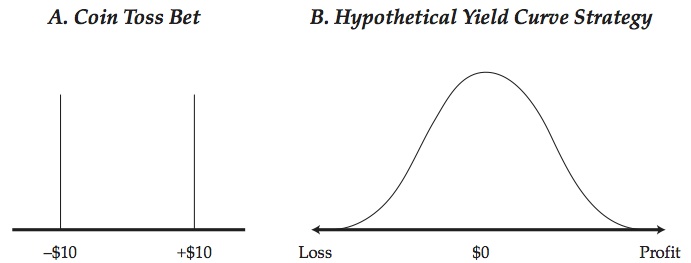
To make sense of this answer for readers who are not quantitative risk specialists, I will give a short review of options, implied volatility, and VaR. First, let’s start with VaR. Quantitative risk measurement focuses first and foremost on the P&L distribution. Consider a very simple business – flip a coin and win $10 if heads, lose $10 if tails. The P&L distribution will look like that in panel A of Figure 1 – 1/2 probability of losing $10 and 1/2 probability of winning $10. That is a complete description of the possible P&L.

P&L Distribution

P&L Distribution

But P&L for financial firms tends to look more like that in panel B – largest probability of small gain or loss, and a small probability of a large gain or large loss. (For more on this, see chapter 2 “A Practical Guide to Risk Management” or “Quantitative Risk Management”, my books on risk management) The P&L distribution is the most important item in quantitative risk measurement. If we knew the distribution we would know virtually everything there is to know about the possible P&L outcomes. But generally we don’t know or don’t care to use the whole distribution, we use summary measures – numbers that summarize the spread or dispersion of the distribution.

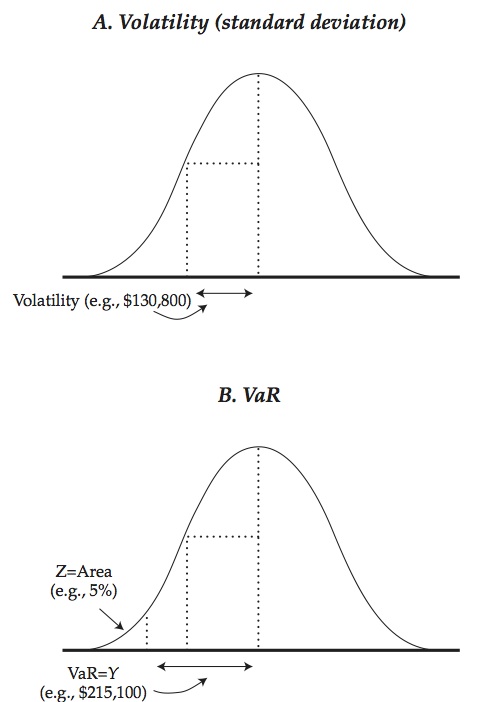
The two most commonly used summary measures are the volatility and the VaR (value at risk). The volatility (known to statisticians as the standard deviation) is based on the squared deviations from the mean – it measures the average deviation from the mean. The VaR (known to statisticians as a quantile) is the point on the left-hand tail of the distribution, such that there is a fixed chance of that loss or worse. (The probabilities are chosen as, say, 5% or 1% or 0.1%.) Figure 2 shows the volatility (panel A) and the 5% VaR (panel B) for the one-day P&L distribution for a hypothetical bond holding.

Volatility and VaR

Figure 2 – Volatility and VaR for the 1-day P&L for a bond

The volatility and VaR tell us about the spread of the P&L distribution. In some cases (for example if the P&L distribution is normally-distributed) we can directly calculate the VaR from the volatility. In all cases, they both summarize the spread or dispersion and tell us about the P&L distribution, just from somewhat different perspectives.

We never know for certain what the P&L distribution will be tomorrow. We can make an informed guess or estimate what it was over some period in the past. This at least gives some basis for decision-making. (As George Santayana said, “Those who cannot remember the past are condemned to repeat it.”) The distribution in figure 2 is estimated for a holding of $20mn of the 10-year US Treasury bond as of January 2009, based on historical data from the year before.

Now we turn to the VIX and options. Consider a put option on a stock. It pays off when the stock price is below the pre-agreed strike price. Figure 3 shows the idea diagrammatically. The stock price starts at S0 today and the price may go up or down. By the expiration date it will have spread out into a distribution like shown in the diagram.

Option Valuation

Figure 3 – Diagrammatic Representation of Option Valuation

On of the most important factors in this is the spread of the future prices, and this is measured by the volatility of the distribution. The more spread out are possible futures prices the higher the probability that the actual price will end up below the strike and the put option will be valuable.

Where does the option model volatility come from? We need to make a guess or projection of what it will be over the life of the option. If it is higher, the option price will be higher. If lower the option price will be lower.

But if we observe traded option prices in a liquid market we can back out the implied volatility – what the volatility must be to give the observed market price. In a real sense this is a market consensus volatility – what market participants think the future volatility will be, agreed by bidding and offering for options in the market. But there are two caveats. First, there may be market technical factors that push the option price higher or lower than it would otherwise be. Second, and this gets deeper into the mathematics, the distribution is the risk neutral or martingale equivalent distribution. This is subtly different from the true or objective distribution. Generally there should not be a huge difference but they will not be the same.

Now we can address more precisely whether the VIX is used in calculating the VaR. If the portfolio contained only positions in the S&P 500 index then we could use the VIX (the S&P option implied volatility) directly, subject to the two caveats above. But it will almost never be the case that a portfolio contains only the S&P index. When a portfolio contains many assets the correlations or covariance structure matters – assets will offset each other and diversify the risk.

Consider a very simple example – you hold $20mn of 10-year US Treasury and $5mn of S&P index futures. The portfolio P&L distribution (and thus the portfolio VaR) will depend on the S&P volatility, but also on the bond volatility and the correlation between the bond and the equity. The S&P volatility is one component that helps estimate the portfolio volatility and VaR, but only one.

So the short answer is, the VIX and portfolio VaR measure similar things (the spread of the price or P&L distribution) but generally for quite different portfolios (the S&P versus the assets you hold in your portfolio). While the VIX might help in estimating the portfolio VaR, it is generally only one part, and often a small part, of the overall answer.

Posted in Risk Management | Tagged , , , | Leave a comment

Managing financial risk and the limitations of quantitative modeling

John Kay in a 2011 column says that the management of risk is “almost entirely a matter of management competence, well-crafted incentives, robust structures and systems, and simplicity and transparency of design.” (“Don’t blame luck when your models misfire” Wednesday 2 March 2011). Mr. Kay is absolutely correct. This idea needs to be spread far and wide. Formal modeling is limited.

But focusing on management competence, etc., hardly means rejecting quantitative techniques, as the balance of Mr. Kay’s column seems to imply. In today’s complex financial markets management competence requires quantitative techniques, not as a substitute for managing but as a set of tools that enhance true management competence. Managers need to upgrade their quantitative skills and understanding, making a concerted effort to learn and use such techniques rather than turning their back on them.

For example, what is the chance that we would observe a run or streak of 10 heads in a row? Intuitively we would think very low, because the chance of flipping 10 straight heads with a fair coin is less than one in a thousand. Seeing such a streak our intuition tells us that the coin is probably biased or the person flipping the coin is cheating. It turns out, however, that our intuition can mislead and we must supplement intuition with formal modeling. Consider flipping a coin once a day for a year, roughly 255 working days. The probability of getting a streak of 10 or more heads sometime during the year is about 11%. Surprising but true.

Now let us turn to a real-life situation. Say we were considering a mutual fund and compared the fund’s day-by-day returns for the past year with the S&P index. What if the fund beat the S&P for 10 days running at some point in the year? Is that strong evidence for a “biased coin,” that our fund beats the S&P more often than just flipping a coin? No. The formal modeling tells us that such a streak is not so unlikely after all.

Or take the case of William Miller, manager for the Legg Mason Value Trust Fund. Through 2005 the fund beat the S&P 500 index for 15 years straight. (Leonard Mlodinow, in his delightful 2008 book The Drunkard’s Walk, discusses Miller’s streak, and I have studied that streak and more recent, shall we say, less stellar performance.) A 15 year streak seems extraordinary. One analyst was quoted as putting the chance of such a streak at lower than one in 372,000 or 0.003%. But in reality such a streak is not unlikely. When we look back over many years, and when we consider the pool of many thousand mutual funds that might by chance outperform, such a streak becomes pretty likely. The chance we would see some fund during the last 40 years with such a streak is something like 30%, not 0.003%. Another example where formal modeling tutors our intuition.

Formal modeling does not have all the answers by any means. Extreme events are a prime example. By their nature they are rare and so hard to quantify. But an understanding and appreciation of quantitative modeling can prove invaluable.

What does it mean when David Viniar, chief financial officer of Goldman Sachs, says “We were seeing things that were 25-standard deviation moves, several days in a row” (August 2007). Maybe he meant “Don’t blame us, we couldn’t foresee events, bad things have happened and it’s not our fault.” If so it was a silly, even disingenuous, statement, and he would deserve the opprobrium he has received. But I suspect he meant: “We have seen a number of days with large profit and loss, much larger than expected given the history that we used to build our risk models, and much larger than would be predicted if markets behaved according to a normal distribution. This is a warning sign – a sign that our models are wrong and that something is happening that we do not understand.” This is a sign of a robust organization that responds to new evidence. And we know that Goldman did cut their exposure to mortgage-backed securities during 2007 because their risk models showed something was awry, and that as a consequence Goldman did not suffer the same scale of losses during that summer. (See Joe Nocera’s useful story in the New York Times, 4 January 2009.)

Quantitative tools have a role throughout the finance industry. They apply to insurance companies as well as investment banks or hedge funds. Insurance companies do fail, and they fail for the very reasons described in quantitative risk models.

Reflect on the case of the Equitable Life Assurance Company, the world’s oldest mutual insurance company. Equitable closed to new business in December 2000 following an unexpected adverse ruling in the House of Lords in July 2000. The closure, however, was not the result of an unanticipated event; the ruling was the proximate but not the underlying cause. The foundations for the closure were laid over 40 years earlier, with insurance policies that included an embedded interest rate option. The situation gets a little complicated (which is why careful thought and attention to detail is important for managing risk) but in essence many policyholders had the option to choose an annuity that would pay out either a pre-set fixed rate or a market-determined rate. During the inflationary 1970s that option was worth virtually nothing, but as rates fell the contingent liability grew. When the market rate fell below the fixed rate (which happened in 1993) many policyholders started to exercise their option to receive the higher rate.

This was a classic interest rate option, with the Equitable’s liability rising as interest rates fell. Quantitative risk models are well-designed to capture the risk of such options. In practice the Equitable did not hedge against, reinsure, or adequately plan for such risk. This risk, a risk that we can see could have been quantified and managed, is what ultimately brought the Equitable to its knees. It was not an unforeseen event, but poor management allied with sloppy risk measurement. It was a failure of management to apply the appropriate quantitative models rather than a failure of the models to adequately capture reality.

In conclusion, Mr. Kay is absolutely right that managing risk is a matter of management competence, but management competence requires using and understanding quantitative models and tools. Too often senior managers in financial firms sidestep their responsibility to understand the businesses they manage. Finance is a complex business and cannot be run simply by hunch and instinct. Intuition too often misleads. Intuition needs to be married with hard analysis and concrete facts. Running a financial firm cannot be reduced to a mathematical model but it does require careful use of quantitative tools.

Posted in Risk Management | Tagged , , | Leave a comment

Marginal Contribution to VaR for Simulation

Last week I was talking to a group of risk professionals and advocating marginal contribution to risk when someone asked “what about calculating marginal contribution to VaR for historical or Monte Carlo simulation?” (NB – we’re talking here about Litterman’s marginal contribution, the contribution for a small or marginal change in an asset holding – RiskMetrics calls it “incremental VaR” and they use the term “marginal VaR” for completely removing an asset from the portfolio – but that’s not a “marginal” change. Oh well. See Exhibit 5.2 of the free download A Practical Guide to Risk Management or p 317 ff of my Quantitative Risk Management.)

I happen to think marginal contribution is one of the most useful portfolio tools for managing risk. One can calculate marginal contribution to volatility, or VaR, or expected shortfall – in fact contribution for any linearly homogeneous risk measure. It is easy to write down the formula for contribution to volatility and VaR (see my book Appendix 10.1, pp 365-368 or McNeil, Frey, Embrecht’s Quantitative Risk Management equations 6.23-6.26). When estimating by parametric (also called delta-normal or variance-covariance) calculating contribution to volatility or VaR is fast and easy.

But for simulation (historical or Monte Carlo) contribution to VaR has some severe problems. Contribution to volatility is still straight-forward, and the sampling variability of the estimate will go down as we increase the number of trials in the simulation. Not for contribution to VaR – the sampling variability of the estimate is large and will not go down as we increase the number of repeats or draws for the simulation. A longer simulation does not give a more precise estimate of the contribution to VaR.

The problem is that the contribution to VaR for an asset depends on the single P&L draw that happens to be the alpha-th P&L observation for the portfolio (the simulated alpha-VaR). The contribution to VaR depends on that single P&L observation in such a way that the sampling variability does not change with the number of trials in the simulation. (I run through a simple example on p 367 that may make this a little more clear. (But the sentence in the middle of the page should read “For Monte Carlo (with correlation rho=0) there will be a 10 percent probability that the marginal contribution estimate is outside the range [0,1], when in fact we know the true contribution is 0.5.”))

BUT there may be a work-around – what we might call the “implied contribution to VaR”.

  • According to McNeil, Frey, Embrecht’s Quantitative Risk Management (p260) the marginal contribution to VaR will be proportional to the marginal contribution to volatility for any elliptical distribution. (Same for expected shortfall.) And the class of elliptical distributions is pretty large – beyond the normal it includes fat-tailed and even distributions having no higher moments: Student-t, simple mixture of normals, Laplace, Cauchy, exponential power.
  • This may provide a way to get marginal contribution for VaR under simulation, as follows:
    • Calculate marginal contribution to volatility – this will be relatively well estimated by simulation since it depends on the variances and covariances. The sampling variation can be made small by increasing the number of repeats in the simulation. Call this the marginal contribution to vol in levels – MCvolL
    • Divide through by the value of the volatility – call this new variable the marginal contribution to volatility in percent – MCvolP
    • According to McNeil, Frey, Embrecht the MC to vol and to VaR will be proportional (as long as P&L distribution is elliptical), so that MCvolP = MCvarP
    • You can now get the marginal contribution to VaR – multiply MCvarP by the estimated VaR: MCvarL = VaR * MCvarP = VaR * MCvolP
  • The alternative (which I suggest in the appendix but which has some obvious problems) is to run multiple complete simulations:
    • For each simulation calculate marginal contribution to VaR
    • Average across simulations
    • There are two big problems with this. First it is very expensive – having to run a large number (hundreds or thousands) of complete simulations. Second, for historical simulations you only have one set of draws – the history. (Unless you bootstrap using the historical observations or in some other way use the historical data to create the distribution from which you draw for Monte Carlo – but this might be a good idea anyway.)
    • Note, however, that each simulation can be pretty short, since the sampling variability of the estimated contribution to risk does not really change with the number of repeats
    • Another alternative is to use a few of the P&L simulations just around the alpha-VaR simulation, and then average the contribution-to-VaR estimates. You can arrange so that the sampling variability will go down as the number of draws increase. But the sampling variability will still be large.

Let’s look at some simulation results. Take two assets, X1 and X2, each normally distributed with mean zero, portfolio weight 1/2, uncorrelated, and variance 2 (so that the portfolio variance will be 1). The volatility will be 1.0 and the 5% VaR will be 1.645. The marginal contribution (proportional) will be 1/2 for each asset and both contribution to volatility and VaR. The contribution to volatility in levels is 1/2 for each asset, the contribution to VaR 0.82 for each.

In a simulation we would pick the length – the number of normally-distributed (X1, X2) pairs to draw. I will consider two cases – length 500 and 2000. “Length 500” means we draw 500 (X1, X2) pairs and for each of these 500 pairs calculate the P&L as the sum of X1 and X2. With these 500 simulated P&Ls we can then calculate the volatility (the standard deviation from the 500 observations), the 5% VaR (the 25th-smallest observation), and the marginal contribution to volatility and VaR using the appropriate formulae. But here we are particularly interested in how these measures (volatility, VaR, marginal contribution to volatility and VaR) randomly vary from one simulation to another. Thus I will run the complete 500-pair simulation multiple times – 10,000 times – and calculate the sample standard deviation of the measures (over the 10,000 repeated simulations).

I am also interested in what happens when the original simulation length increases from 500 pairs to 2000 pairs – when we increase the original simulation length by a factor of 4. We should expect our simulated measures to be less variable – the sample standard deviation of volatility, VaR, etc. should go down by a factor of 2 – the usual root-n behavior of Monte Carlo.

The following shows the results for simulations of length 500 and 2000, and repeating the complete simulations 10,000 times.

Length 500 Volatility MC Vol Level MC Vol Prop’l 5% VaR MC VaR Level MC VaR Prop’l
Mean 1.00 0.50 0.50 -1.65 -0.83 0.50
Std Dev 0.032 0.028 0.023 0.095 0.507 0.307
Length 2000 Volatility MC Vol Level MC Vol Prop’l 5% VaR MC VaR Level MC VaR Prop’l
Mean 1.00 0.50 0.50 -1.65 -0.83 0.50
Std Dev 0.016 0.014 0.011 0.047 0.504 0.306

Notice that the sampling variability for the volatility, 5% VaR, and contribution to volatility (the standard deviation over the 10,000 repeated simulations) goes down by 2 as we go from a simulation of 500 to 2000. This is exactly what we expect – the number of repeats goes up by 4 and the sampling variability goes down by 2 – this is the root-n of Monte Carlo. But the sampling variability does not go down for the contribution to VaR – it does not change with the length of the simulation.

The following two graphs show the histogram for the estimated marginal contribution to volatility and VaR for asset 1 (both proportional, so each is expected to be 0.5). This is for 10,000 complete simulations, each simulation 2000 long. Notice how spread out the distribution of contribution to VaR is relative to contribution to volatility – they are on completely different scales with contribution to VaR going from -0.5 to +2.0 and contribution to volatility only 0.46 to 0.54.

plot_MCVaR

plot_MCVol

We can also look at the contribution to VaR in levels. Again, this is for 10,000 repeated simulations, each simulation 2000 long. The distribution of the simulated contribution to VaR is shown in the first histogram – the expected value is -0.82 but the spread is huge with considerable mass as down to -2 and up to +0.5. In contrast the implied contribution to VaR (calculated from the proportional contribution to volatility as outlined above) is very well-behaved with virtually all the mass between -0.9 and -0.75.

plot_MCVaRL

plot_MCVaRLImplied

This simulation shows pretty dramatically the problems with estimating contribution to VaR by simulation, and how the idea of “implied contribution to VaR” solves this problem. OK, you might argue that this simulation is only for two assets and is based on normality. But the proportionality between contribution to volatility and VaR holds for a wide class of distributions (elliptical, which includes Student-t, mixture of normals, Cauchy, Laplace, exponential power) so this technique is likely to work more widely.

In the end, however, I generally look at volatility more than VaR. (One big reason is the usefulness of marginal contribution to volatility and its ease of computation.) I could use VaR but when looking at portfolio issues I generally use volatility. Or maybe that’s not quite the way to say it. I think of two related but different sets of questions:

  1. What is the structure of the portfolio? Questions like what are the risk drivers, where do my big risks come from? Portfolio tools such as marginal contribution, best hedges, replicating portfolios, these are all tools for understanding this set of questions
  2. How much might I lose on the portfolio? What do the tails look like?

These are obviously related (since we’re talking about the same portfolio) but I am perfectly comfortable to use different sets of tools for those different sets of questions. Volatility (and marginal contribution, best hedges, etc., which work nicely when looking at volatility) works well for the first set of questions. VaR and other more tail-specific measures work well when I want to think about tail events. But I might use different statistics and even different estimation techniques for the two sets of questions.

Posted in Risk Management | Tagged , , | Leave a comment

Thinking Probabilistically – HIV screening in the U.S. and South Africa

How can the same HIV test and screening process have the dramatic differences that show up between the U.S. and South Africa?

Thinking carefully about probability is so often useful in our every-day lives. I was reminded of this once again after talking with a young South African mountain guide high in the hills of the Western Cape. Conversation had turned to medical issues, and the topic of HIV-awareness and HIV-screening came up. There was a degree of mutual incomprehension regarding testing policies in the U.S. and South Africa. For a young South African, annual screening is a matter of course. For an American, widespread testing of the general population seems odd – it is not the norm.

It seems to me that thinking about probabilities and what the tests can tell us goes far in explaining differences in national screening policies. Consider testing someone from the general population in the U.S. versus South Africa. A positive test result for the U.S. person provides little information about whether the individual actually has HIV, while a positive test for the South African is a very good indication that the individual has HIV, and thus is a candidate for treatment. In the U.S. screening has less individual and public health benefit than one might think initially, while in South Africa it has potentially large benefits.

How does this happen, that the same test can have such differences in the two countries? It has to do with the underlying infection rates in the two countries, and to understand we turn to Bayes’ theorem. And using Gigerenzer’s “natural frequencies” makes it easy to see what is happening. (See Gigerenzer’s Calculated Risks. Also chapter 2, p 48 ff of my book Quantitative Risk Management or chapter 2 of A Practical Guide to Risk Management.)

The HIV test (the inexpensive enzyme immunoassay test commonly used in initial screening) is roughly 98.5% accurate, in the sense that 15 out of 1000 tests give a false positive (the test shows positive for someone who is not infected with HIV). Consider screening 1000 individuals from the general U.S. population. There will be roughly 15 false positives. How many true positives? The underlying infection rate in the U.S. is about 0.6% so we should expect roughly 6 true positives. In sum, 21 positive results but only 6 out of 21 true positives – 29%. In other words, a positive test for someone from the general population in the U.S. provides little useful information on whether the person is truly infected with HIV – a positive test means less than 30% chance you are actually infected with HIV.

Now consider testing 1000 individuals from the general South African population. There will still be roughly 15 false positives. But the underlying infection rate is more like 15%, so there will be roughly 150 true positives. In sum, 165 positive results with 150 out of 165 true positives – 91%. This provides good evidence that the individual is infected and would benefit from treatment of one sort or another. (For reference, properly applying Bayes’ rule gives probabilities of 28.6% for the U.S. and 92.1% for South Africa, assuming the HIV test is 99.7% accurate in reporting true positives.)

Further testing to confirm the test will, of course, reduce the false positive rate. But the fact remains that the information provided by initial screening is different for the U.S. and South Africa and may help explain differences in approaches to screening. Simply thinking probabilistically helps make differences that initially seemed peculiar more understandable.

Posted in Miscellaneous, Musings | Leave a comment